I have decided to rename my project, which is exploring redevelopment/gentrification in the East London districts of Shoreditch, Spitalfields and Whitechapel, After Marville…
The previous name Blueprint presumed the use of cyanotype as the means of printing the work. At this stage it seems much more appropriate to leave things open.
My tentative version one artist’s statement is set out below:
I have also produced a short video of the early work I’ve completed on this project. The images included in the video are all digital which have been edited to appear like old photographic plates (to look like Marville’s images of Paris). The idea here is to give the viewer the impression that the images are old and potentially picturesque/anecdotal photographs of London. The truth is quite the opposite as the images show how the old East End is being overwhelmed by high rise steel and glass. The form of presentation also directly references Marville and his documentation of Paris in the 1800s although this point would most probably be lost on most viewers unfamiliar with this work.
The images were all shot on a handheld Sony A7s – a full frame but small digital camera. This camera is designed to produce high quality images at high iso, enabling hand held images to be produced in low light conditions. All have been taken with an Voightlander Super Wide-Heliar 15mm (version 1). This extreme wide angle lens enables me to capture a broad scene from close up – essential to the concept where I am attempting to show how large buildings are being constructed close to older houses, warehouses and shops. It does suffer however from optical aberration problems at the corners due to field curvature issues. This means that whilst the centre of the images is pretty sharp the corners are soft and a little distorted. In Marville’s day lens technology was at an early stage of development so this kind of problem might well have occurred (depending on the lenses he used). As such I am relatively happy with these imperfections.
In contrast to ‘Lifting the Curtain’ the images include people, as they are shot in daytime. However, due to the extreme wide angle of the lens I have been using the people look small, and are dominated by the buildings. This is a deliberate strategy to represent people as just small cogs in the larger ‘machine’ of redevelopment and gentrification.
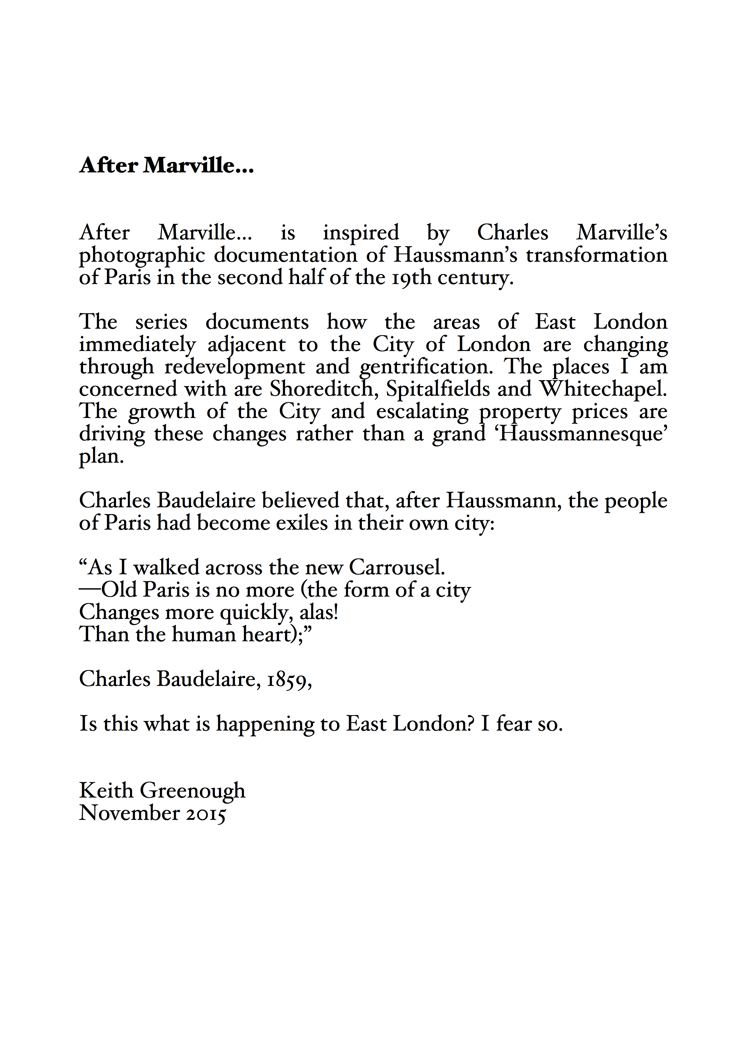
The video can be viewed by clicking the photograph below:

After Marville… early work ©Keith Greenough


anomiepete
November 5, 2015
Good luck!
Keith Greenough
November 5, 2015
Thanks…early days.
anomiepete
November 5, 2015
Maybe this is your MA? Possibly as CSM as I think you have mentioned using their facilities before …
Catherine
November 5, 2015
It all fits together well. The environment seems very bleak, whereas some of the buildings in Paris are quite grand. The music you chose suits the mood.
It all makes me think about a novel – someone drifting through London. Yes, it would be a novel about someone who works in London so doesn’t feel as if he/she belongs there but, at the same time, doesn’t feel as if s/he belongs where s/he sleeps.
jsumb
November 5, 2015
So here goes, and I know its early stages! For me this is an issue that centres on the processing; the sepia toning, the sometimes obvious vignetting (a post process artefact as opposed to a processing artefact) which is directing me to look back, and fondly, perhaps with a sense of melancholy at a more tender time. Haussmann whilst creating significant controversies also delivered equal advantages, but there were many at the time who wanted to look back – some still do – at a Paris romantically interwoven with arrondissements despite its incredible issues. And now there are many who view the state of Paris to ready for another upheaval, as I said before plus ca change. Your work with Booth coupled the past with today in a way that suggested that nothing much has changed; the malevolence of racism, poverty et al, are as pervasive as ever and the ‘brilliant’ (technical term) prints which contemporised those issues made it current and relevant.
My cultural and photographic heritage suggests that the imagery you are making here is how much better it would be if nothing changed, and I know well enough that isn’t what you are trying to do here, but the aesthetic is troubling for me. I think that the underlying narrative might be about neoliberalism, about the destruction of a way of life of the many by the few. I was struck by the work of Paolo Woods and Gabriele Galimberti “The Heavens, Annual Report” which, whilst it commented on neoliberalism in a completely different way also had ‘brilliant’ prints to do it with.
As I say I know this is early days and it will develop (in the tray on on screen 😉 ) and I will continue to watch with great interest.
Keith Greenough
November 5, 2015
It is an interesting point that the processing does invite one to look back nostalgically to the past and present that as what should remain. My intention was not that rather I hoped that the processing would act as means of inviting the viewer to look at the photographs and then given the shock of the modernity cause them to consider what is happening and to take a view on it. My statement I agree implies that I view the redevelopment as potentially bad….this is not always the case I know. My primary goal is to document what is going on and to invite people to consider their position on the issues, but that said I am not at all comfortable with a situation where redevelopment is resulting in communities being displaced and being replaced by high rise of foreign owned apartments left empty…
Keith Greenough
November 5, 2015
I forgot to add that I must (maybe subconsciously) be uncertain about the processing or use of platinum printing and so on as I have also produced a set of colour digital prints to consider as an alternative… posting these now to seek more feedback on this issue. Worth noting that if I were to present these I would probably want to consider other camera lens options as the 15mm voightlander is a bit too blurry for my taste in this form of presentation.
jsumb
November 5, 2015
I’ll look at the colour work