John Umney raised concerns in his comments on my previous post that the archaic form of processing invited the viewer to look back on the past with nostalgia and to consider the new as necessarily bad (paraphrasing here so forgive me John if I got this wrong). Subconsciously this issue must have been bothering me too as in parallel I have already produced a set of colour prints of the same images. I planned to review with OCA colleagues at the Thames Valley Meeting on 21st November.
I thought it might be interesting to post these images here to invite further feedback…
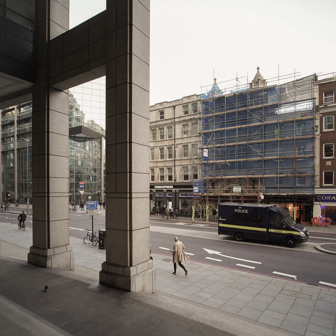
©Keith Greenough 2015

Keith Greenough ©2015

Keith Greenough ©2015
Keith Greenough ©2015
Keith Greenough ©2015

Keith Greenough ©2015

Keith Greenough ©2015

Keith Greenough ©2015

Keith Greenough ©2015

Keith Greenough ©2015
Keith Greenough ©2015

Keith Greenough ©2015
Keith Greenough ©2015


Catherine
November 5, 2015
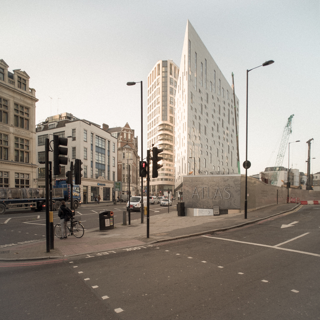
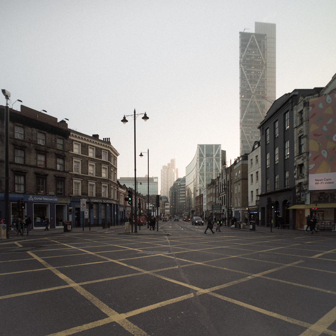
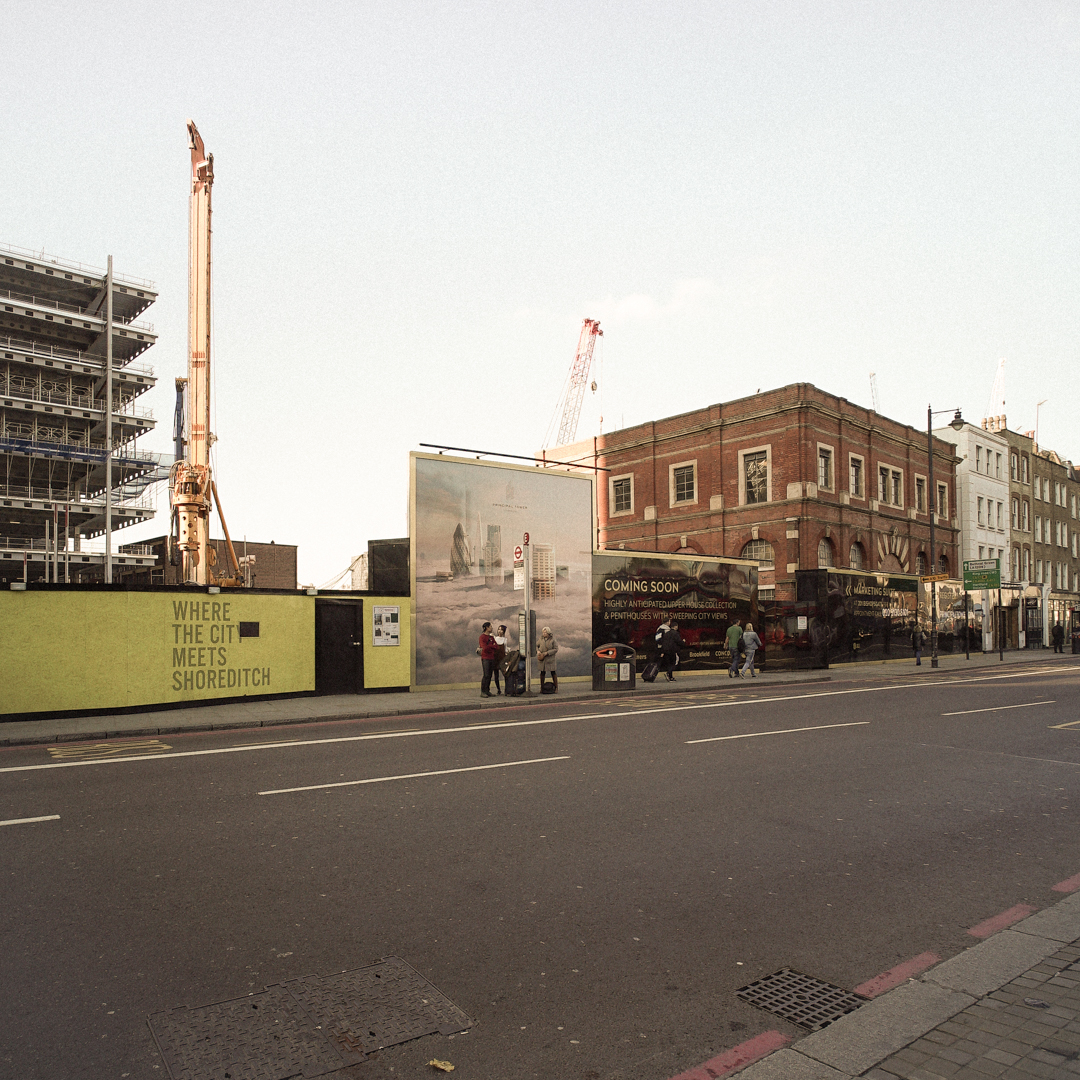
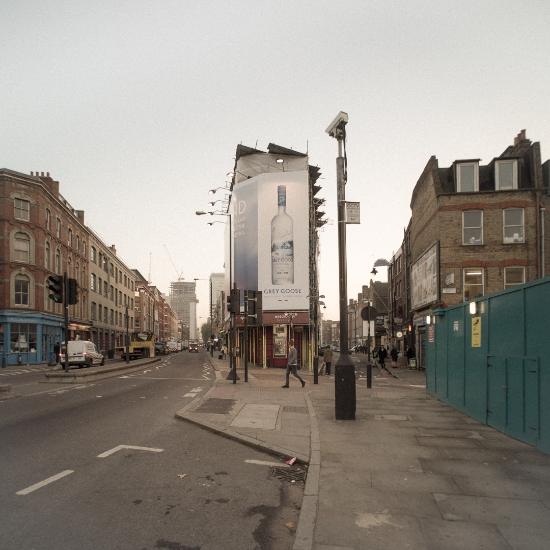
They do strike my eyes more in terms of the contrast between old and new – the first and seventh particularly. I know you referred to the people being small in the frame, which I think is what you aimed for, but there are so few of them. There’s an emptiness about the streets. Don’t know what time you were there. Will be good to discuss at TV group.
Keith Greenough
November 5, 2015
Thanks Catherine. Looking forward to 21st. The key issue I wanted to discuss was in fact how the mode of presentation influences interpretation of the work.
anomiepete
November 5, 2015
My question is whether you are clear in your intention about use or not of the particular mode of presentation irrespective of how others might interpret it. Did the idea of using a cyanotype approach meet YOUR intention or does the colour approach better serve it? I am sure there will be a great diversity in how people receive and interpret the work and don’t really think you have too much control over than save for using your artist’s statement.
Keith Greenough
November 5, 2015
At this stage Pete I am not entirely sure how the project will turn out which is why I am simply getting out again with my camera and making images. The work will develop from my explorations. I am interested in how modes of presentation will influence meaning and with this in mind I need to consider alternatives approaches and what they connote. Early days.
jsumb
November 5, 2015
Well they look gorgeous, can’t tell whether they are ‘blurry’ or not on screen. Our preconceptions of narrative response are troubled by the past, these images, to these tired old eyes, are more open than those sepia toned photos you showed previously – sorry not to be able to see the real things in Thatcham – but needs must!
They are clearer for me in their representation of what it is you want to describe, the slightly subdued palette helps me to consider perspective, a harsher, more didactic palette might not have done. I really think this works better, but I may be in a minority of one! As Pete says above, how do you feel about the development of what you want it to say/project?
Tanya Ahmed (@Photographs_NYC)
November 5, 2015
Hi Keith, I think it is interesting that even in color you have a very muted palette. I’m following with interest.
Keith Greenough
November 6, 2015
Yes…this was deliberate. I had the sense that this would give the images a more objective feel – not really sure if this is the case. Lots more to do on this project. The first step is to confirm through getting out there taking photos that the project has potential….the aesthetic approach will emerge as I work through.