I’ve decided to put my current deliberations on image selection and how to present the image/text pairings on hold for now as I am falling behind on the work I need to do for my Critical Review.
I have selected 13 images which work for me at least in principle. Some of the images I will re-do as I have yet to capture them exactly as I want, but many are in good shape. I have also decided on the texts I want to pair with the images. Again this is by no means the final position, but certainly good enough to present to Sharon my tutor to gain some initial feedback.
As regards how to present the images/texts, I feel that I would like the image/text to form a single panel for display, rather like Martha Rosler did with her Bowery image/text combinations. David Gillanders also used this approach in his ‘Uncivilised’ series. I am not happy with placing the text on the image itself – for me this feels too much like magazine copy (although I do accept that there are many art works in which this approach is taken – Burgin and others). I have decided to present the image/text combinations as 30×30 inch panels. With the text included on a black background either at the bottom (for landscape images) or at the right hand side (for portrait images). I chose black as it references my theme of “Umbra Summus” or translated from the Latin “We are Shadows”. For now I have chosen a font for the text which simulates a typewriter script. This has historic connotations which suits the work, although some of my sources for the texts would have been published on early printing presses.
The image/text panels are intended for gallery display – ideally in a location in Spitalfields such as one of the old Georgian Houses. Each panel would be accompanied by a conventional caption panel which would simply state the title of the particular piece. I decided on a gallery display as this will give the viewer time to consider the works. The devil is in the detail with some of them. For example, the Jewish reference for the Wentworth Street image is in sharp contrast to the mostly Eastern names on the shops now there. The shop names would be easily read on the prints at the size I envisage but the viewer would have to look carefully.
Click the image below to see a pdf of the images

The individual image/text panels are shown below:

Regents Canal, near Limehouse Basin September 2013
©Keith Greenough 2014
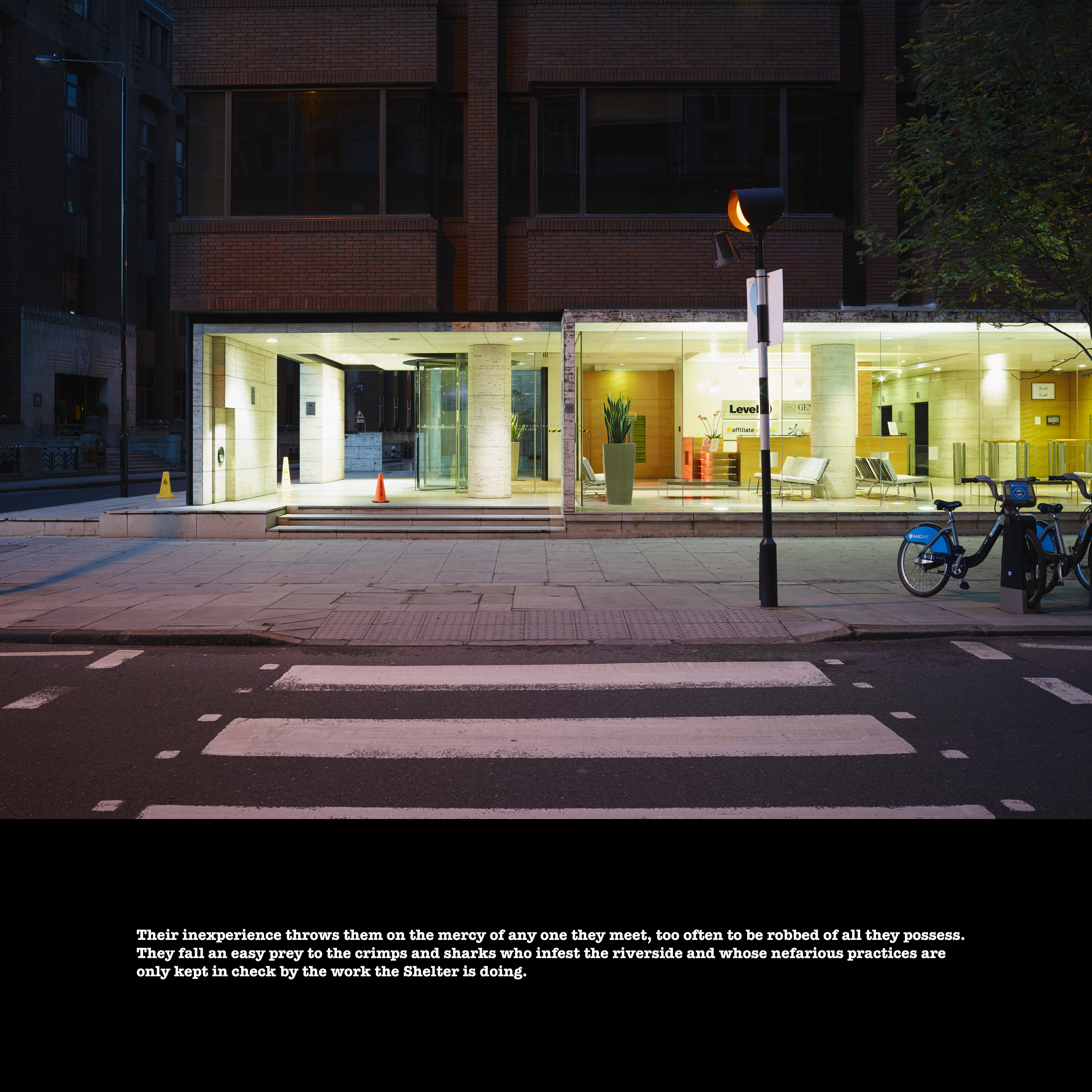
Office entrance on site of former Jews Temporary Shelter, Leman Street November 2013
©Keith Greenough 2014

Christ’s Church Spitalfields through window of house on Fournier Street, January 2014
©Keith Greenough 2014

Pennyfields, close to West India Dock Road, January 2014
©Keith Greenough 2014
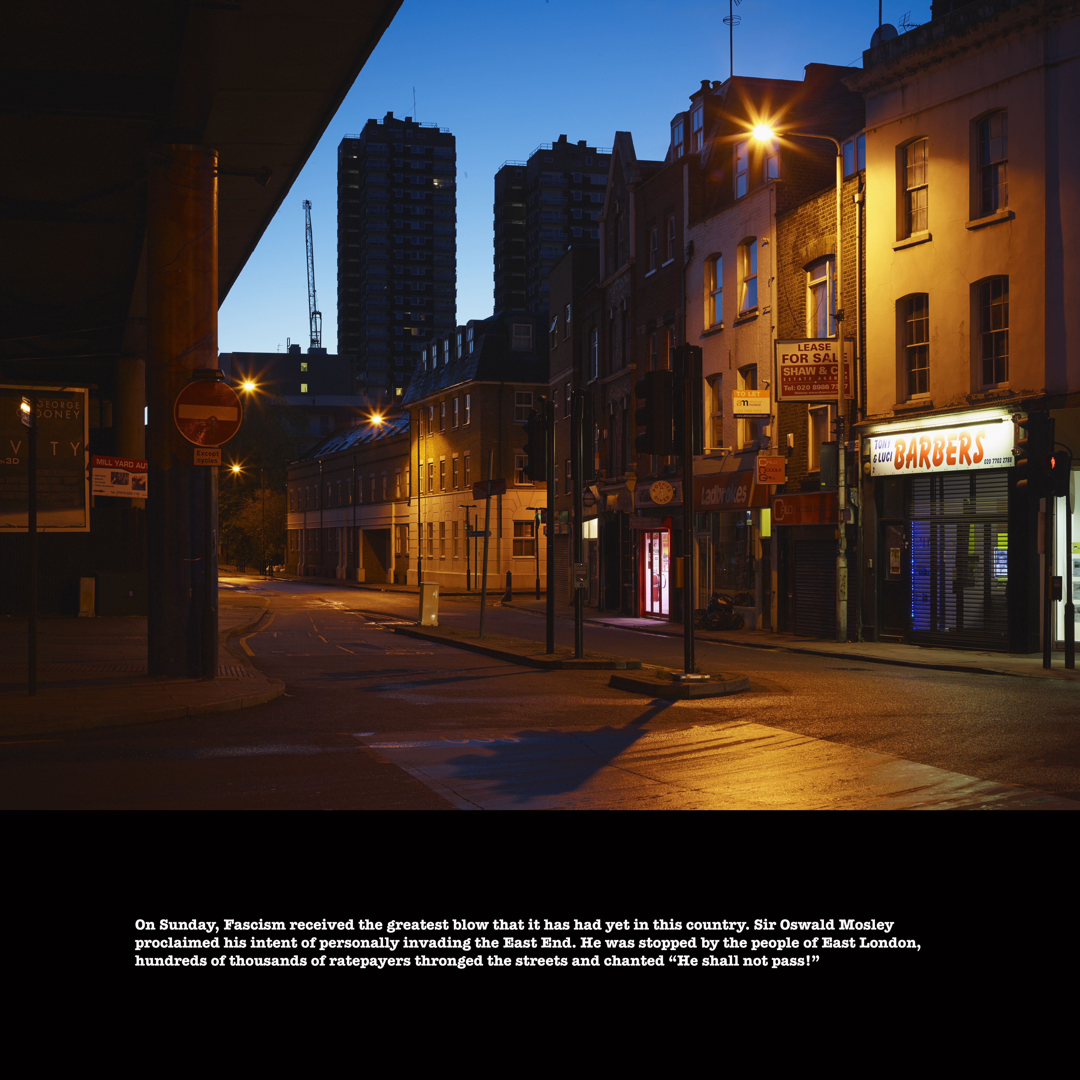
Cable Street, looking East from junction with Leman Street, November 2013
©Keith Greenough 2014

Adler Street by Altab Ali Park, January 2014
©Keith Greenough 2014
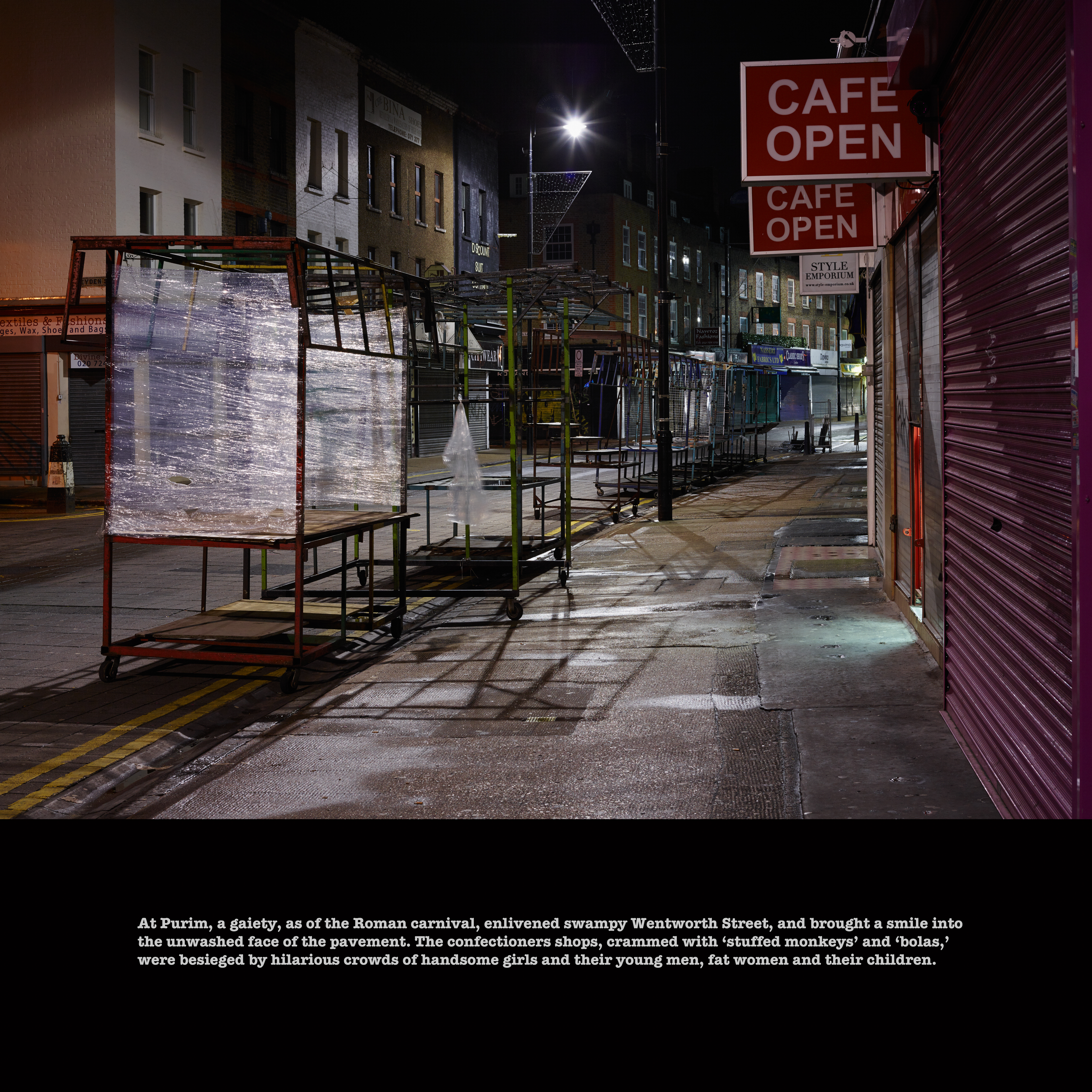
Wentworth Street Spitalfields, January 2014
©Keith Greenough 2014

Brick Lane Spitalfields, January 2014
©Keith Greenough 2014

Hanbury Street, Spitalfields January 2014
©Keith Greenough 2014

Entrance to house on Princelet Street with former Synagogue in rear garden, January 2014
©Keith Greenough 2014
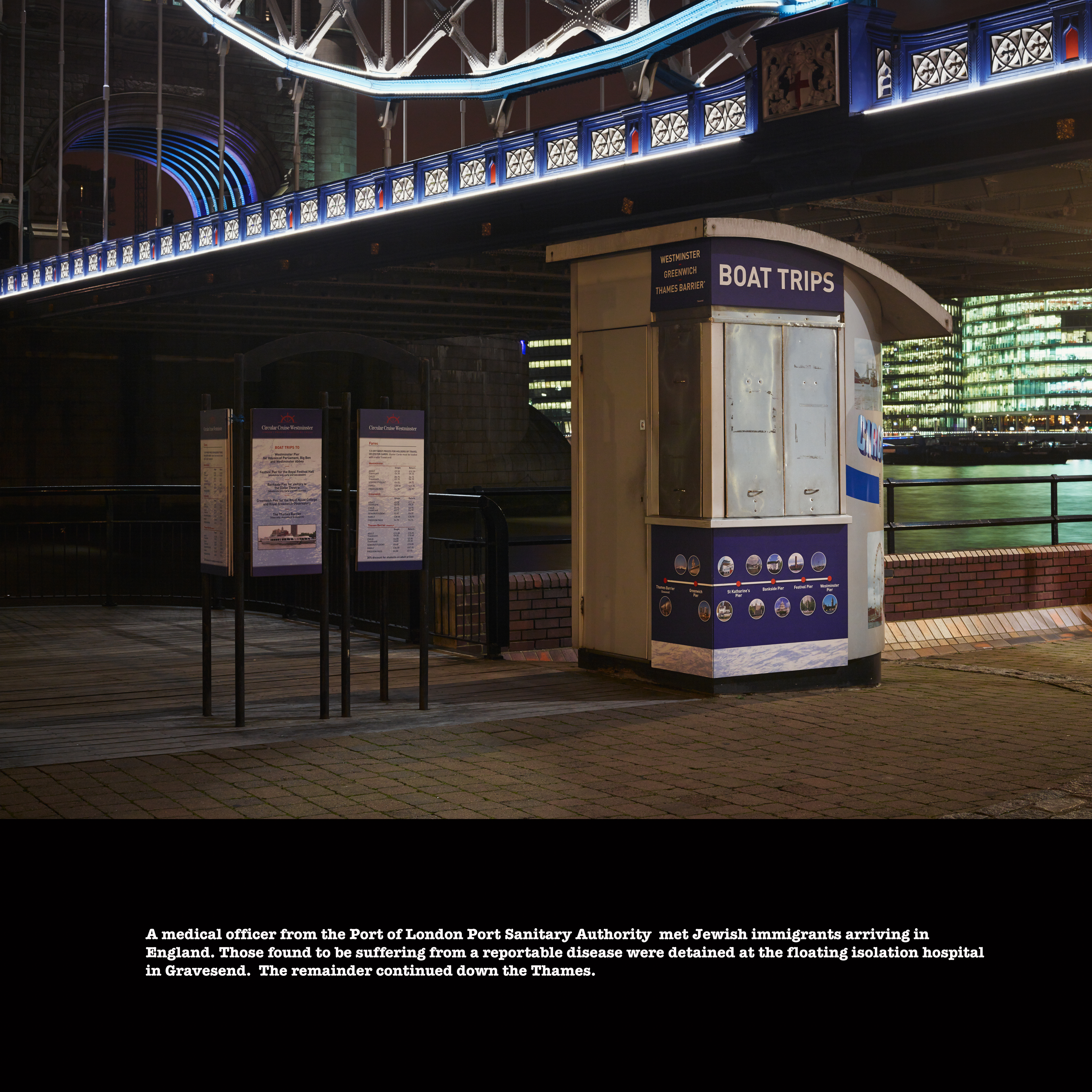
St Katherine’s Wharf, January 2014
©Keith Greenough 2014

Quayside Limehouse, January 2014
©Keith Greenough 2014

Junction of Brick Lane and Bethnal Green Road, January 2014
©Keith Greenough 2014


Catherine
January 14, 2014
The white text on black panels is quite striking.
Keith Greenough
January 14, 2014
Yes maybe too striking.
Catherine
January 14, 2014
I wasn’t actually thinking it’s too striking. Interesting though that it takes up a much smaller area and yet demands attention. In that sense it balances past and present.
Carol Street
January 14, 2014
Hi Keith, I find when looking at these it is the text that grabs my attention first and only when I’ve read it do I look at the image. So for me it’s like looking at two adjacent images – text box and photograph, but always looking at the text first. Not sure if this is of help or not, as I haven’t followed your most recent posts closely enough (sorry!) to know whether this is your intention.
Keith Greenough
January 15, 2014
Thanks for the feedback Carol. I am not unhappy that the text and image be viewed as separate panels but your point emphasises the point that Catherine made that the white on black text is very striking…it was not my intention to give priority to the text. These panels at least gather together for now my images and texts….much more thinking and experimenting to do here….