Another question which has been vexing me is how to physically link the text and image for viewing. There are many options: a slide show with the text presented before/alongside/after the image; a book with text presented on the opposite page to the image; a book with text captions in an appendix; gallery prints with the text on panels alongside the images; gallery prints with the text in a exhibition catalogue or book; and gallery prints with the text embedded within the image.
I had not considered the last option until I started to review some of Victor Burgin’s work as part of my background research. For many of his works Burgin embedded the text in the image panel. An example of this is presented below:

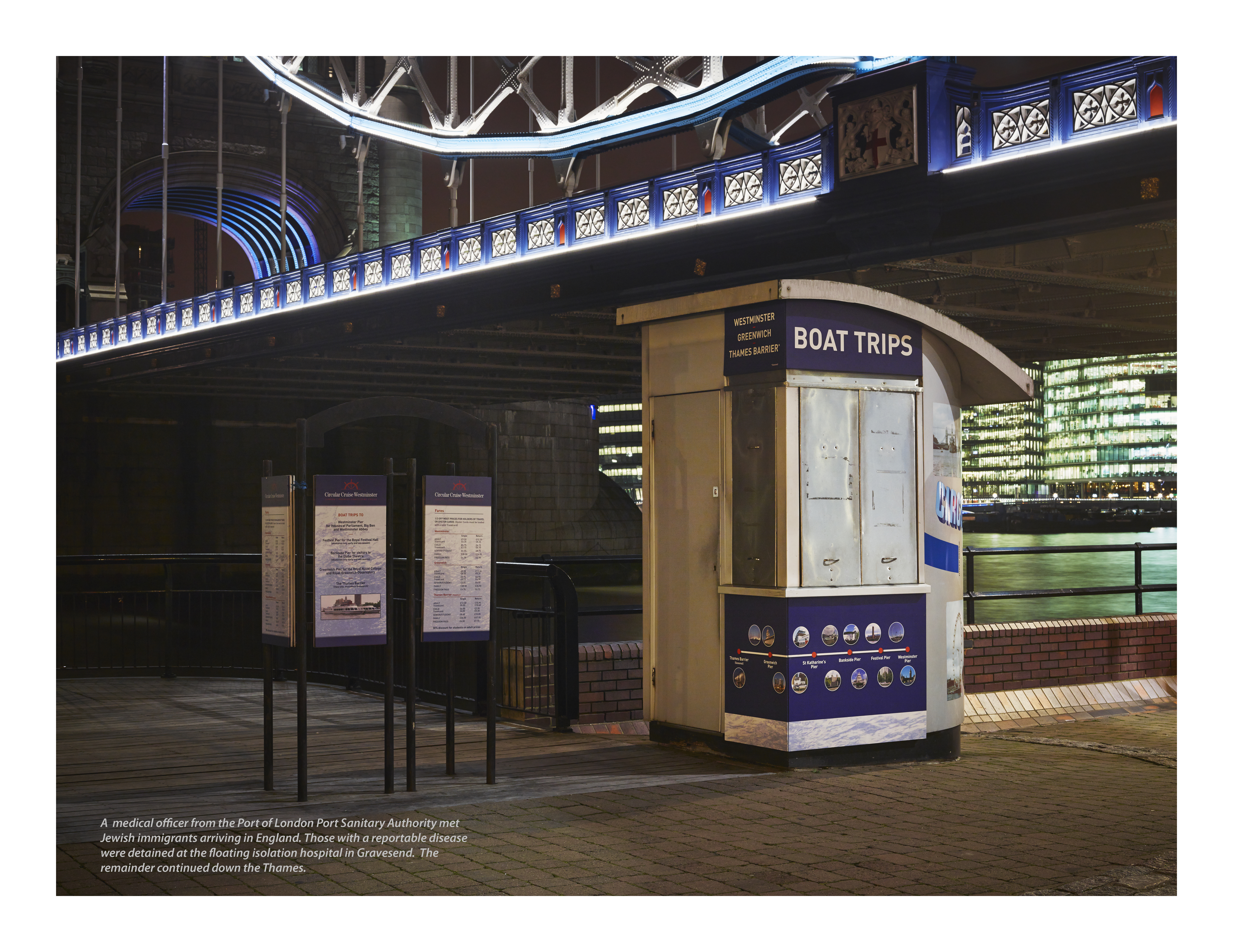
FRAMED
©Victor Burgin
In an interview published in his book ‘Between’ (Burgin, 1986, pp 57) Burgin talks about how text and image work together to create meaning:
‘We usually see words to comment on the image in some way; for example, to give some extra information about what is shown in the image. Alternatively we can see an image used to illustrate a text – to show pictorially what has already been mentioned verbally. I tend to do neither of these things.’
In the case of the image/text FRAMED he goes on to explain that the title relates to the frames referred to in both the image and the text; for example, the picture itself, the Marlboro man, the photo and mirror referred to in the text and so on. The work ‘framed’ is also used to describe how someone or something has been misrepresented as in ‘I was framed by the bad guys’. In the context of this work Burgin uses the word framed to refer to cultural stereotyping, where people are pigeonholed into neat boxes (or frames) – the macho Marlboro Man, the effeminate hairdresser and so on. The text and image work alongside one another to achieve this representation.
Later in the book Burgin is asked how the viewer might come to understand what he is getting at, since some of the linkages between image and text require the viewer to know a lot more than is presented in the work itself. In response Burgin presents this view (Burgin, 1986, pp 81):
‘There can never be any question of simply and finally ‘understanding the meaning’ of the work. The meaning isn’t ‘in’ the work, like a lump of cheese in a wrapper; nor is the meaning somewhere behind the work: in the mind of the author, for example, or in ‘reality’. Meanings are the product of an individual’s meaning of the work and these meanings depend on that individual’s particular biography and upon his or her social, cultural milieu.’
I have to say there is a lot in what Burgin says here and reading his comments has added to my internal debate on how the image/text combinations should be presented and how they should work together. I have a feeling that Burgin may end up being a major influence.
I thought it would be interesting to see how embedding the text within the image would look for a few of my own images. I am trying to get my mind around whether this fundamentally changes the nature of the work. For one thing it makes it absolutely clear that the work is the image/text combination. It would also no longer be possible to show the images simply as pretty pictures – the text would always be present. On the other hand placing the text within the images somehow seems to ‘spoil’ the images and it seems to make them seem like advertising or newspaper pictures, not serious photography. For the examples presented below I have kept the text small to avoid making the images look overtly like publicity material, but….
Here are the images. The text is small so to see it clearly it will be necessary to click on the image to get a larger version.

©Keith Greenough 2014

© Keith Greenough 2014
© Keith Greenough 2014
REFERENCE
Burgin V. (1986) Between London: Basil Blackwell Limited


Eileen
January 12, 2014
Inevitably this treatment does make on think of a magazine image – as I look at them all, including Burgin’s, I imagine them as part of a magazine of some kind. That doesn’t have to be a bad thing in itself if it adds a layer of meaning or nuance or works in some way with the pictures. I’m in two minds about it as it stands: interested to see how you take this forward.
Anonymous
January 12, 2014
Yes it could be presented as ironic or parodic commentary on typical magazine representations. For some of Burgin’s work this was definitely his approach. He even presented some of his work in the form of posters which were put up in the streets. At the moment I am not seeing my own work in this way. But it is something to think about.
Catherine
January 12, 2014
My inclination is towards reading the text separately. On a laptop screen I really had to enlarge the image to read the text. This would obviously be different in a gallery. the posters idea seems a good one for, say, publicising the Exhibition.
Keith Greenough
January 12, 2014
Yes I think that there needs to be a reason for representing the image/text combinations in the style of magazine copy. I am not seeing the work this way at the moment. Hope all is well with you and Jeff. Will you be there next Saturday.
Catherine
January 12, 2014
I’m pretty doubtful Keith. It depends how the next few days go.
Keith Greenough
January 12, 2014
That’s a shame but you must absolutely look after things at home first. Take care and hope to see you soon.
jsumb
January 13, 2014
As you know I’m a big fan of Burgin, but hadn’t linked your work to it in this way. However I think it works very well, especially with the narrative sense that it brings to the artwork. This quote from Kutlug Ataman resonated when I saw this entry “We articulate absence through presence and express a thing’s presence by highlighting its absence…..Rather than look at a structure, you are looking at what the structure is defining. The structure is therefore implied by what it is not. Ultimately, this method makes both the structure and its absence appear more complex and essential through its purpose and relationship to other things.”
The disjuncture of text and image is maybe made more clear and complex in this latest manifestation and heightens the effect somewhat in that there is a clear associative power; the text is defined as ‘text’ with, or within, the image. I agree with Catherine that maybe it needs to larger in scale – screens are terrible for reducing impact in so many areas, it’s a wonder why we bother sometimes 🙂 – Burgin’s prints I saw recently were 16″ X 20″ I’m fairly sure and the text was perfect at that size as it seemed to draw the spectator in and engage with the piece more intimately without needing to rub your nose on the image.
Getting more interesting with every update….
Keith Greenough
January 13, 2014
Thanks John….excellent quote. If I am interpreting it correctly in the context of my own work it is the very fact that people are absent from my images draws attention to the fact that people were there, and in my case were there at some time in the past.
Since the prints will be quite large, possibly 30×40 inches, the text should be readable at the present scale. The question I am pondering is what is my rationale for adopting what is a ‘magazine’ style of presentation, which inclusion of the text on the image does connote. Also if I do include the text, how much space should it take on the image. In other words how much importance do I place on image versus text….all interesting stuff. More reading of Burgin and Sekula is on my agenda. And more thinking about my own approach.
jsumb
January 13, 2014
I came to these images not from the perspective of a magazine at all, I recognised the connection with Burgin and that delivers me to the gallery wall – with all that engenders – and not to a magazine, I don’t see that at all.
As regards the quote, yes, that is exactly how I see it and it is one the anchors I am trying to use to fix for my personal project assignment five – Documentary, and as Joan Fontcuberta declares a ‘decisive space, not a decisive moment’! It’s what I am trying to use light to indicate, whereas you are using both the composition (the time of day and the aesthetics) AND the disjunctive text. I think this is continuing to work very well…..