In my previous post on presentation strategy I indicated that a book and exhibition to be the most appropriate and effective means of presenting my work. This approach echoes that of Charles Booth when publishing his work and can be used to create a form of presentation that encourages the viewer/reader to engage in a dialogue with the image/text pairings. A book is also a format in which I can sell my work as a means of raising money for Toynbee Hall – a key component of my presentation strategy. In this post I deal with how I plan to design and produce the book. It’s physical form, structure and sequence, and mode of production are considered, along with the method of production, editioning and sales.
Physical Form of Book
There are many ways in which a book such as ‘Lifting the Curtain’ could be produced. For example it could be produced as a handmade ‘artists’ book, as a folio of prints with associated texts or as a conventional book. For each of these there are many detailed parameters to be determined, size, aspect ratio, hard/soft cover, type of paper, type of binding and so on.
My decision to use the book format was in good measure based on the fact that it echoes Booth’s original presentation approach. Booth in fact published his work in a conventional hard back book. As such using a this format would seem most appropriate. The availability of on-line book printing services such as blurb.com also makes short run book publication relatively economic. As it is my intention to produce around 35 copies (30 for sale and 5 for my own purposes) the facility to produce multiple copies, relatively quickly and at reasonable cost is very important. The books will be sold as part of a fundraising effort for Toynbee Hall as explained in my previous post. My total inexperience in producing handmade books and folios and very high cost of commissioning the production of books/folios in ‘one-off’ form rather precluded these options in any event. I therefore decided to produce the book as a conventional hard back book and as I already had first hand experience of blurb.com I decided to use this service for its production.
The next question I considered was the size of the book. In the first instance it is vital that the images in the book are of a size which enables the viewer to be able to see important elements clearly. As I explained in my previous post, with my images the ‘devil is in the detail’. In the case of the image of Wentworth Street which shows part of the historic Petticoat Lane market, for example, it is very important that the viewer can read the names on the shop fronts in the background. The text refers to Petticoat Lane being the ‘exchange of the Jew’, but the image now shows through the shop names that the market is largely Asian. This shows what has changed, i.e. it was formerly Jewish and is now Asian, but also alludes to what has not changed, i.e. it continues to be the ‘lounge of the Christian’ – a place that satisfies the colonial fascination with the strange ‘other’.
I produced test copies of the book in two formats, 10×8 inches and 7×7 inches. The former is roughly twice the size. The photograph shows the comparative sizing.
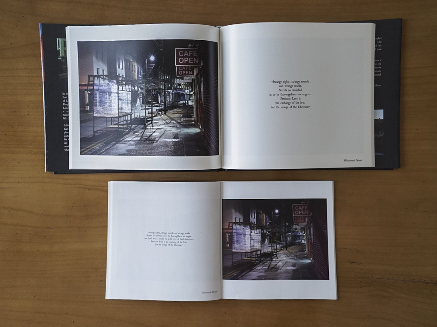
Lifting the Curtain – Book Size comparison. 10×8 inches top, 7×7 inches bottom
The images in the 7×7 inches version are quite small and in truth it is not possible to make out the detail in the background. With the 8×10 inches version the names on the shop fronts are readable. Ideally I would have preferred a slightly larger format for the book which would make the background clearer, but here a second factor comes into play – cost. A 11×13 inches version of the book in hardback form costs around twice that of the 8×10 inches. As I am self-funding the production of the books this is an important consideration, so on balance I decided to go with the 10×8 inches format.
The next factor to consider was the paper quality to use. I produced a number of test versions of the book using various qualities of paper that blurb.com offer – ProLine Uncoated (148 GSM matt paper), ProLine Lustre (148 GSM lustre paper) and ProLine Pearl Photo (190 GSM photographic paper). I rejected the matt paper very quickly as the photographs appeared very flat, with lower contrast and saturation. Shadow details were also lost in many of the photographs. The results were very similar for the other two options with the main differences being that the paper finish for the 190GSM paper was whiter and the greater weight of the paper gave the book a more substantial feel. So on purely aesthetic grounds the 190 GSM paper would have been marginally preferred. However, this option adds a cost of £8 per book, i.e. £290 for 35 copies. On balance I did not feel that the additional quality of the paper justified the additional cost as the results for the 148 GSM Proline Lustre paper were of a high quality in any event. I decided on the ProLine Lustre (148 GSM) option.
The final point I considered with regards to the physical form of the book is the nature of the book cover. I had already decided on a hard cover book to echo Booth’s survey book. The question remained however as to whether to have a cloth bound book with no cover, a cloth bound book with a dust cover or book where images and title text are embedded onto cover (blurb.com call this image-wrap and the appearance gives the book a contemporary feel). Ideally I would have preferred a cloth bound book with no dust jacket and with the title text foil stamped onto the cover and spine. This would have given the book the feel of an old book, such as Booth’s. In practice however blurb.com only offer this facility for orders in excess of 300 books. This is way beyond the number I have in mind (around 35 books). As an alternative I researched the possibility of producing the books through blurb.com and then using a third party printing service to complete the foil stamping. This, however, turned out to be impractical as foil stamping can only be done on flat surfaces and it would not have been possible to stamp the title and author name on the spine of an assembled book. This I judged to be a critical limitation. I felt strongly that the contemporary feel of the ‘Image-wrap’ cover was inappropriate, given the subject matter. I therefore decided to choose the option of a cloth bound book with a dust cover. My thinking was that I would select a relatively sombre image for the cover to give the book a sense of gravitas.
So, in summary, I decided to produce the book in 8×10 inches format, with a cloth hard back and dust cover using ProLine Lustre (148GSM) paper. The cost of each book including shipping and VAT would be around £30. My idea is to produce the book as a limited first edition of 30 plus 5 artist’s copies. Total cost of production would thus be £1050. My intention would be to sell 30 signed copies of the books for £30 each, which if successful would raise £900 for Toynbee Hall. I am confident that with sales to friends and colleagues along with sales during my planned exhibition I will be able to sell this number. Should demand outstrip my supply, I would issue a second edition and sell this directly to the public through blurb.com. For this second edition, I would up the price to £35 and donate the profits, c. £5 per book, to Toynbee Hall.
Structure and Sequence
I decided to structure the book into three parts: an introduction incorporating a foreword written by Toynbee Hall and an artist’s statement written by me; the main body comprising of the images and texts; and a reference section giving details of the sources of the texts and maps showing the locations of the photographs. The introduction presents a contextual framework within which the work should be viewed. The main body presents the work itself and the reference section provides additional data to enable an interested viewer/reader to interact with the work in a more informed manner and validates the integrity of the texts used.
I have deliberately kept the introductory paragraphs brief. Inclusion of the foreword by Toynbee Hall adds weight to the work and positions the relationship between Toynbee Hall and Charles Booth – Booth and his team were based at Toynbee Hall and the objects of his survey were in line with the mission of Toynbee Hall which was ‘to enquire into the condition of the poor and to consider and advance plans calculated to promote their welfare’. I am currently in the process of getting Toynbee Hall’s agreement to write the foreword. They are reviewing my draft and I am hopeful that they will agree. My artist’s statement is brief. It explains my interest in East London, how I came to discover Charles Booth’s survey and the nature of the work itself, i.e. juxtaposition of modern day urban landscapes with historic texts drawn from Booth’s survey. It does not comment on the fact that the images were made at night and early mornings when no one was around. My intention was that the absence of people and the dramatic lighting would give the images the feel of an ‘empty theatrical stage’ onto which viewers are invited to project the scenes witnessed by Booth (as set out in his texts). The absence of people and deep shadows in the photographs also serve as metaphors for the transience of life and people past and give the work a psychological charge. I allow the viewer to form their own views on this during their interaction with the work.
In the main body I present each image/text pairing on opposing pages of a two page spread with both the image and the text centred on their respective page, giving each equal weight. I have chosen to present the text on the right hand page and the image on the left. This is contra to normal conventions and is an idea I got from looking at Chloe Dewe Mathews’ book ‘Shot at Dawn’. This emphasises the importance of the text as the eyes of the Western viewer will fall naturally on the right hand page first. It also differentiates the text from a normal caption which most often is subordinated to its image by the way it is placed on the page (below the image or on the left hand page or at the rear of a book). The text is centre justified and broken up/arranged so to further differentiate it from a caption and emphasise its autonomous status. This approach also allowed me to place emphasis on key words at the end of each line. This is an approach used by by both Karen Knorr and Anna Fox in their image/text works.
The narrative flow of the book takes the form of a series of episodes (from both past and present). I decided to start the book with a photograph of a point of arrival – a landing stage on the Thames where many of East London’s immigrants would have arrived in Booth’s day. The associated text comments on the perception of immigrants. I return to the river for my final image which looks out across the river to the Docklands development at Canary Wharf with a text commenting on the outcomes of re-development. In sequencing the image/text pairings between these points I have decided to group them according to the social issues to which they relate – housing, working conditions, class and race relations, poverty, crime, social relations and redevelopment. Where there is more than one image/text dealing with a particular social issue I have used my aesthetic judgement to decide on sequencing. By grouping in this way I hope to emphasise the nature of each social issue under consideration through repetition.
Here is the latest version of the book (click on image to open a pdf version of the book):


Anonymous
January 18, 2015
Hi Keith, it was fab to see the book yesterday and to hear about your plans for this work; I only joined in half-way along the journey of ‘Lifting the Curtain’ but it has been great to see it progress to where it is now; you must be vey proud. It’s so helpful for us at the lower levels of our studies to see what is expected at Level 3, even if you have set that bar incredibly high!
Thanks for the loan of the Calle book btw – it’s cold and grey here so that will be this afternoon’s reading.
Keith Greenough
January 19, 2015
Thanks for that Carol….I am very pleased with the work but at the same time glad I am nearing an end….feel like I want to tackle something else now…forcing myself to finish off!! Enjoy the book.
anomiepete
January 18, 2015
Hi Keith,
Have you thought about accepting orders now so you can get a feel of how many books might be sold to your network? For example, it might be helpful to you if you created a spot on your blog where people could register an interest in buying the book. Just an idea.
All the best
Pete
jsumb
January 18, 2015
I agree with Pete, there will be a number of students, maybe even the college, who would be pleased to order a copy. Good to see it yesterday and good luck with ‘run-in’ to the finishing tape!
Keith Greenough
January 18, 2015
Thanks John. See you Wednesday.
Keith Greenough
January 18, 2015
Good idea Pete. Once I gave the final sign off from Toynbee Hall I can put a sales tab on my blog and start taking pre-orders. Will also promote by email to my contacts, Facebook, Flickr and Twitter.
Astbury Photography
January 19, 2015
Based on the pdf I think this is looking very good, the image and the text working on their own and together, the whole thing feels very coherent.
Just wondered if this was done with the Lightroom Book module and if so what made you decide to use this over Blurb’s own BookWright (or other tools)?
Keith Greenough
January 19, 2015
Hi Duncan…glad you liked the book. I did use Lightroom. My reason was simple. By using Lightroom I ensure that the images used in the book and for prints are the same. The book and exhibition prints are driven from the same set of images. Its also very easy using Lightroom…