In my previous post here I indicated that the principle forms of presentation that I will use are a book and an exhibition of prints. This post discusses questions about the nature of prints I would use in an exhibition. It is concerned with the sizing of prints and the spatial organisation of the image and the text.
Print Sizing
The size of a print dictates how the viewer will relate to it and the amount of detail that the viewer can derive from it. My aim with ‘Lifting the Curtain’ has been to engage the viewer in using his or her imagination to project a past scene or narrative into the modern day urban scene represented in the photograph. It seems to me that a larger photograph will enable the viewer to better imagine her or himself within the scene depicted. This was also the view that Chloe Dewe Mathews put forward when discussing the exhibition prints for her Shot at Dawn work, see here. Lucy Soutter also comments that ‘…the general consensus appears to be that large-scale photographs signal tremendous ambition and demand to be taken seriously. At the same time, they fill the viewer’s entire field of vision, producing an immersive experience of visual detail that can be almost overwhelming.’ (Soutter, 2013). I recall experiencing the sensation of ‘overwhelmed’ when viewing Zarina Bhimji’s large prints at her 2012 exhibition at the Whitechapel Gallery, see here. Since my work was made on a medium format digital camera I could very easily, without loss of clarity, produce prints up to 40×50 inches.
A second reason why I would prefer larger prints is that for many of the image/text combinations the ‘devil is in the detail’. Small details in the images reveal a lot about the scene today. For example in my image/text Wentworth Street the text refers to the former Jewish market on this location. Today the market is largely Asian but this can only be seen if one is able to read the names on the shopfronts, which one can do if the image is large. The switch from a Jewish to and Asian market is important in signalling the changes that have taken place. It is also important that the Asian names are readable to convey the idea that Western fascination with the ‘strangeness’ or ‘otherness’ continues on today.
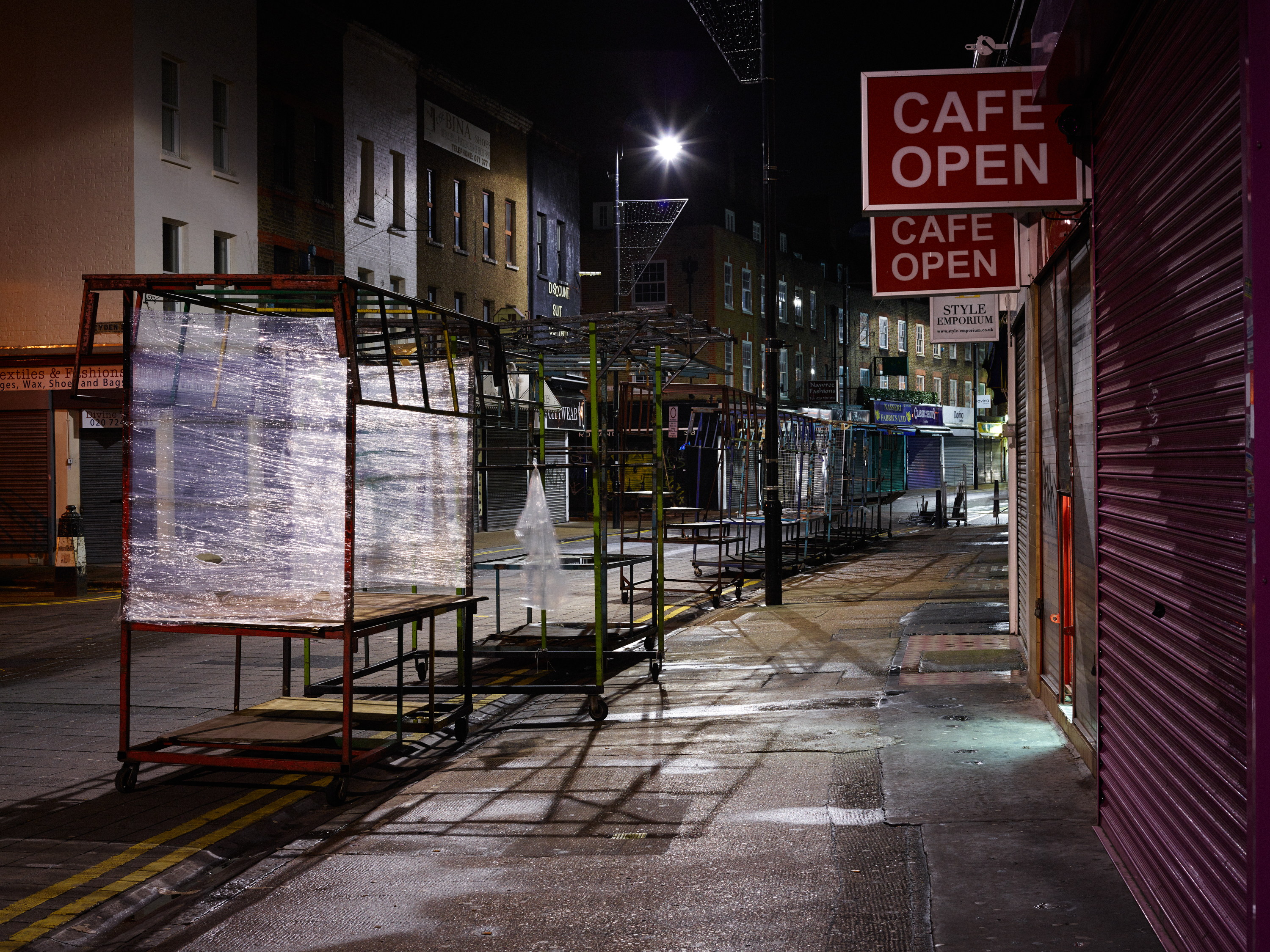
Wentworth Street, ©Keith Greenough 2014
Apart from the expense, there are two downsides however to using large prints. The first is a practical difficulty which relates to the size of possible venues for showing my work. My aim is to show the work if possible in Spitalfields, close to Charles Booth’s former base at Toynbee Hall. Proximity to Toynbee Hall is important to my strategy as I plan to use the exhibition and book as a means of raising money for this charity, which continues to help the needy in East London through the provision of advice and education. The charitable link will also help me to promote my work and provide a hook to draw people to any event I stage such as a book launch or exhibition. Most inexpensive gallery spaces are relatively small. Many of the cafe’s, bookshops and so on which offer space for artists to show work offer a limited amount of space. The second issues concerns the relationship between the image and text. If the images are very large, they could overpower the text, and potentially sever the link between image and text which is a vital facet of the work. This of course depends on way in which the text and image are arranged spatially. I will return to this point later.
On the question of cost, the major expense is not printing the work but the framing. A 30×40 inch c-print for example would cost around £56 from Printspace in London. The total cost for a framed print using a black wooden frame with window mount would cost £365. 8 images of this size for an exhibition would cost some £3000! If I were to print the images to a size of A2 myself and frame them using 50×60 cm frames purchased on line, each framed image would cost around £25 or say £250 for and exhibition of 10 images. The economics of the larger scale photographs are clearly inconsistent with the idea of raising money for the charity – it would be better I feel for me to reduce the cost of the exhibition and to donate any spare money to the charity itself. If I were to increase the size of the prints to 60×80 cm, I would need to get the photographs printed professionally and the framed prints (if I framed them myself using frames purchased on the internet) would cost £60 each or say £600 for an exhibition of 10 prints. An alternative of course is not to frame the prints and to simply pin them to the wall or to mount them simply on foam core. Ironically, the latter would cost 10% to 30% more than framing the photographs myself if I were to get it done professionally (which I would need to do as I would not trust myself to do it without ruining an expensive print!).
So weighing up my desire to produce large prints against the practical constraints of space constraints at venues and cost for producing the exhibition my preferred option would be to show the work with framed prints of 60×80 cm. In smaller venues I may need to reduce the size to the 50×60 cm. As an alternative I could consider not framing the prints and simply pinning them to the walls of the gallery space.
Spatial organisation of image and text
When I have shown my work to-date, in Hashtag Magazine and at the PhotoMonth Open, I have presented the work as composite image/text panels as in the example below:
Bethnal Green Road
©Keith Greenough 2014
This has enabled me to control the allocation of space for the image and text. By presenting the work in this way I have not been depending on editorial/curatorial decisions outside of my control as regards the amount of space given to the text in particular. There is however a downside to this form of presentation in that it seems to reference advertising and magazine editorial presentation. Others have commented on this when I have posted the image/texts to on-line forums. This form of presentation is the same as used by Victor Burgin and Karen Knorr in their image/text installations made in the 1980s. For them it was important to reference advertising/editorial conventions. David Brittain commenting on Karen Knorr’s work stated ‘By parodying the conventions of advertising and editorial photography, Knorr unmasks their techniques of persuasion’ (Brittain, 1999). In my work I have no intention of using parody as a device for conveying meaning, so the reference to editorial/advertising copy is distracting.
I needed to find another way to show the work in a way that I can control and which gets away from this link with editorial/advertising. The book form of the work does this very well. Image and text are organised side by side and are given equal weight (one page each with image/text centred). This lead to consider ways in which this might be done in a gallery format. It is worth noting that whilst the book format works well in terms of spacial organisation and offers opportunities for raising money for charity through book sales, the images in a small book lack impact and as such a book alone might fail to capture the imagination of the audience. I will discuss the book format separately in a future post.
Typically in the white cube the photograph is magnificently framed and the caption text is place underneath on a small card. The text is clearly represented as subordinate to the image. I began to think about how to avoid the text being downgraded and came to the view that a major factor is the framing. If I were to frame the text and place it alongside the photograph at equal height, how would this affect the perception of the text? I believe it would elevate the text beyond the perception of it as merely a caption and give it equal standing with the photograph. By presenting the text on a sheet of high quality watercolour paper and ‘floating’ mounting the sheet within the frame so that it is seen as a ‘document’ I believe I could further enhance the status of the text. The framing of the text is a very important element of this design. One only frames things that are important!
Another facet of this design is that the viewer would need to approach the framed text to read it and then to step to the side and possibly back to view the image. This shuttling back and forth between the image and text frames requires the active engagement of the viewer/reader in interpreting the work and also emphasises that the text and the image are separate ‘facts to be observed’ to paraphrase Umberto Eco’s comments on Brecht’s Epic Theatre (Eco, 1989).
The framed image/text pairings would look something like this crude mock-up (I plan to produce a high quality wall mounted mock up of this installation for inclusion with my assessment materials and for my Assignment 5 submission:

Image/text spatial organisation – Lifting the Curtain
I have also produced two variations for how a gallery installation would look using the Google SketchUp CAD tool. The first is for 60×80 cm images plus 11×14 inch framed texts. The second for 50×60 cm images plus A4 text frames.

‘Lifting the Curtain’ installation maquette — 60×80 cm photographs with 11×14 inch text frames
©Keith Greenough 2014

‘Lifting the Curtain’ installation maquette — 50×60 cm photographs with A4 text frames
©Keith Greenough 2014
In addition to the text in the panels there is also the question of what other textual information I provide for the viewer in an exhibition format. In the maquette’s shown above I have included panels which show my artists statement:

Artist’s Statement – Wall Panel for Exhibition
And a further panel showing the maps and references for the locations:

Maps and References – Framed panel for Exhibition
Each of the image/text diptychs would also be assigned a caption card (not shown on maquettes) which would give the name of the location.
Summary
So for now my feeling is that I should be aiming for a gallery display of diptych’s comprising of framed 60×80 cm photographic prints and 11×14 inch framed ‘floating’ mounted text sheets. Supporting the diptychs will be caption cards naming each location, a text panel with my artist’s statement and a framed panel with maps showing the locations and references for the Booth quotations.
Soutter L. (2013) Why Art Photography? Abingdon: Routledge p. 41
Britain D.(Ed.) (1999) Creative Camera: Thirty Years of Writing Manchester: Manchester University Press, pl 193
Eco U. (1989) The Open Work Cambridge: Harvard University Press, p. 20


Keith Greenough
July 6, 2017
Hello,
I think you’ll be happy to read that interesting article I’ve just found on the web, here it is http://tkm.ua/hotel.php?4f4e
Best wishes, Karen Stallings