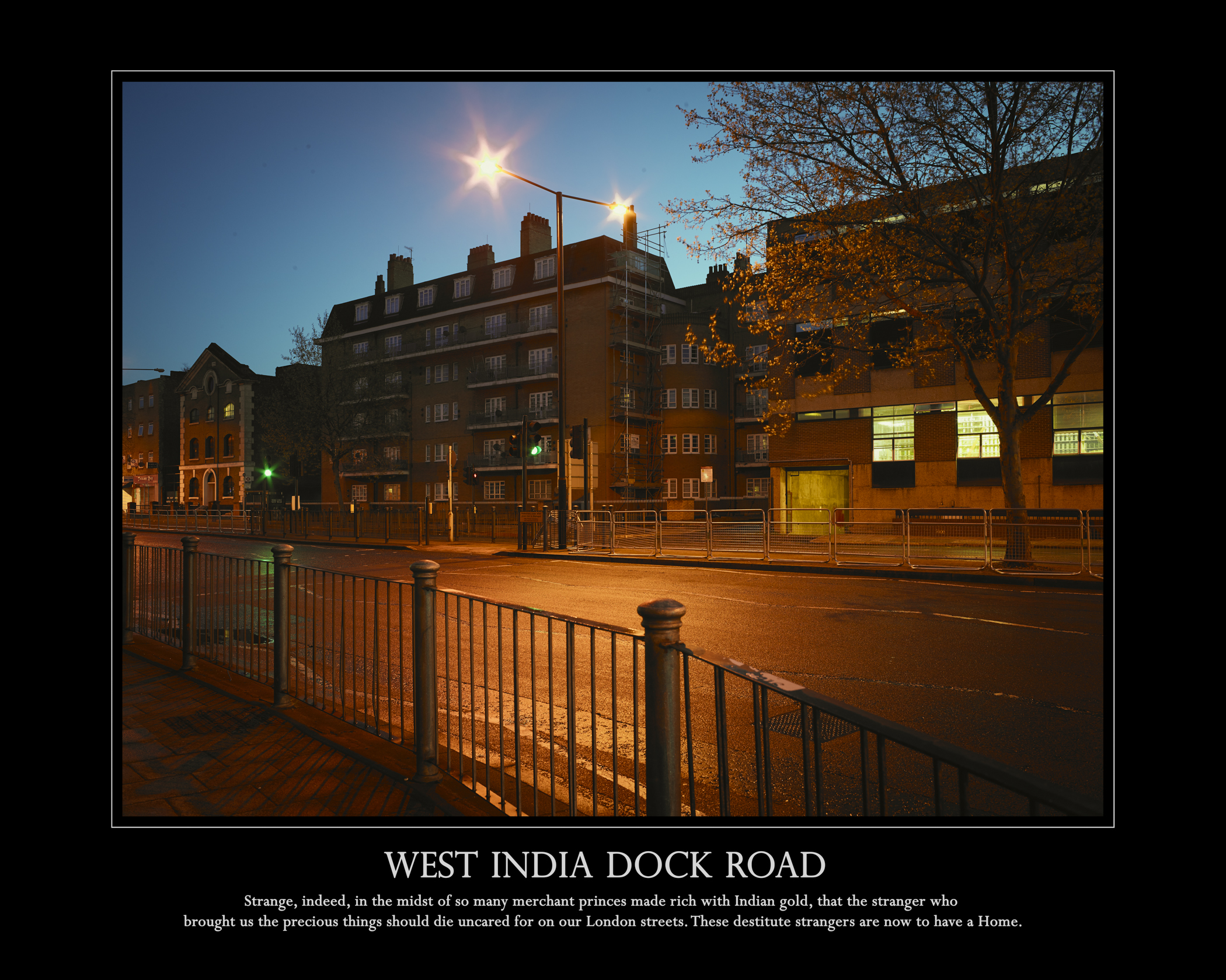
In this version of a potential poster I have retained the black border (this seems to work well with the theme of shadows) and have toned down the colour of the lettering. This gives a more subdued look…..
©Keith Greenough 2014
©Keith Greenough 2014
Posted on April 8, 2014
In this version of a potential poster I have retained the black border (this seems to work well with the theme of shadows) and have toned down the colour of the lettering. This gives a more subdued look…..
©Keith Greenough 2014
©Keith Greenough 2014


Vicki M
April 8, 2014
Prefer this to the previous option—I found the colour distracting. Of all of them, I prefer the second; but not sure why you are opting for the text? Unless it’s just that you want it to have the poster feel?
Keith Greenough
April 8, 2014
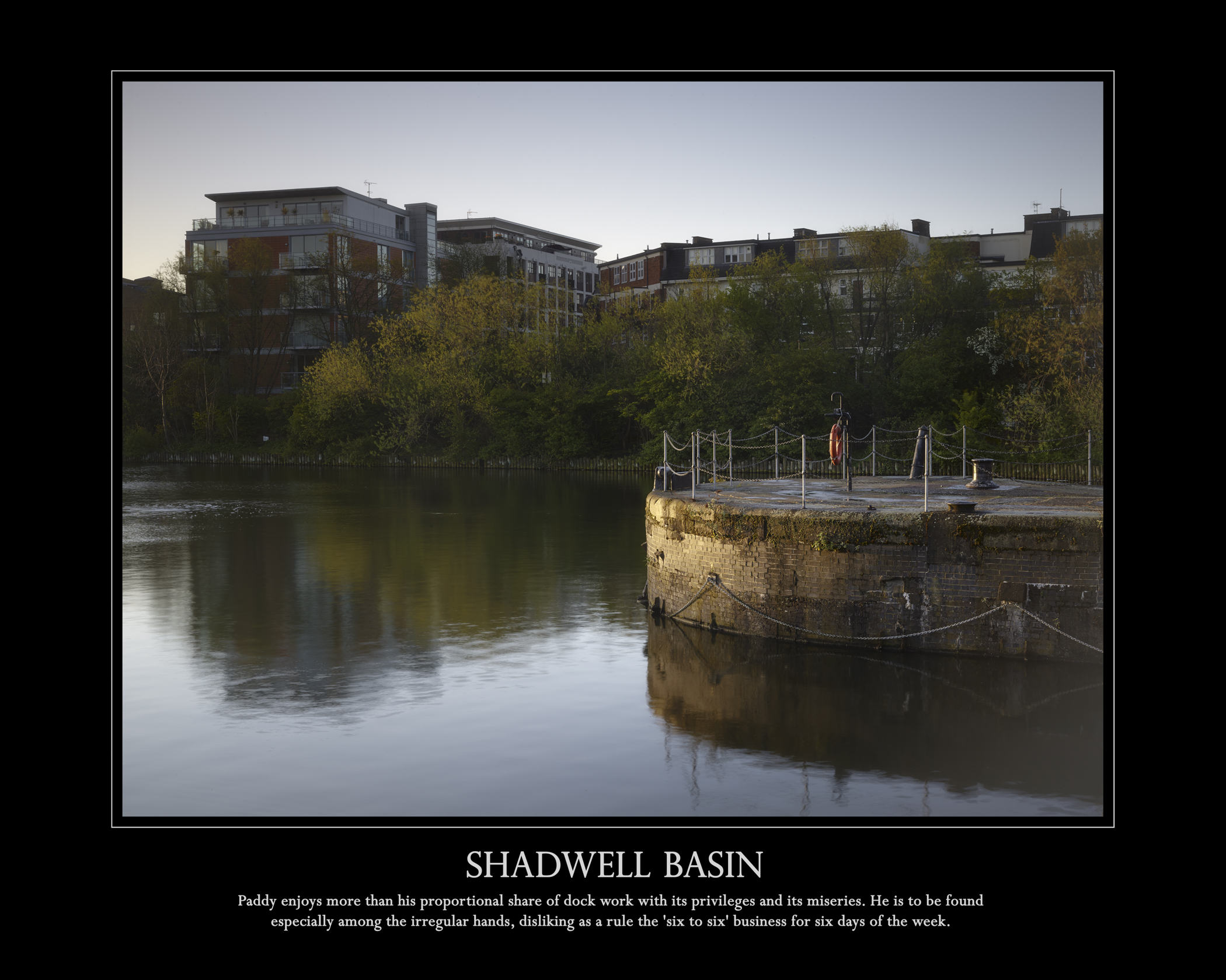
Thanks for feedback Vicki. In fact I have been working with the idea of image text panels throughout. The idea is that there should be a disjuncture between image and text which causes the viewer to stop and think more about what the image might be about. In the case of the Shadwell Basin it used to be part of the London docks and very many of the dock workers were Irish. The text takes the viewer back to the original purpose of the place whereas the image points to its new functions – housing and leisure.
Keith Greenough
April 8, 2014
Hi again Vicki. Think I may have misunderstood. Do you mean why have I put in titles in capitals? The reason is as you thought, to look like a poster.
Catherine
April 8, 2014
They do look more subdued and there’s a heaviness about them that works for the second one, due to the glow from the street, but not for the first. At least for me.
Keith Greenough
April 8, 2014
Thanks for the feedback Catherine. More than anything I was trying to make them look like a poster. For me the white background with no title text is the one I like the best but this is very like a traditional print, although it will be a cheaper and more disposable format. I could try putting the title somewhere less prominent. A footnote maybe.