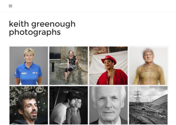
I have at long last brought all my recent work together into a single ‘gallery’ website. This will serve as a reference point for those interested in my photography. The site has gone live in ‘beta’ form…any comments on errors/omissions would be appreciated. Click on the picture below to access the site at http://www.keithgreenough.com.
Posted in: Uncategorized


Catherine
March 18, 2016
A good clean layout. The only problem I’ve found is that the font is too small for me to read easily, even when I’m wearing my spectacles.
Carol Street
March 18, 2016
I like the clean layout Keith. Like Catherine I found the font in the various body of works too small to read comfortably. I also struggled a little with the light grey font in the pages along the top menu.
Keith Greenough
March 19, 2016
Thanks Both… I have now changed/enlarged the fonts a bit…difficult balancing act between readability and being able to fit the text onto a single screen of a smart mobile phone. Had to edit down the text in many cases… see what you think now.
Carol Street
March 19, 2016
That’s better on both counts. I’m viewing it on an 11″ macbook air if that helps. One further comment, on three of your sets (Ground Zero + two others – can’t access the site now for some reason) there isn’t a final line of text with your name and date. Not sure this matters, just mentioning.
Catherine
March 19, 2016
I agree the text is much easier to read now. I’d forgotten that you are presenting for different devices. No problems accessing Ground zero etc.