I have studied Karen Knorr’s work, particularly her Belgravia 1979-1981 and Gentlemen 1981-1983 series and have cited her as one of my influences see here. It is very fortuitous that she currently has a retrospective exhibition showing just these two series at Tate Britain. I went along yesterday to see her work in the flesh as it were and also to have a careful look at how it was installed.
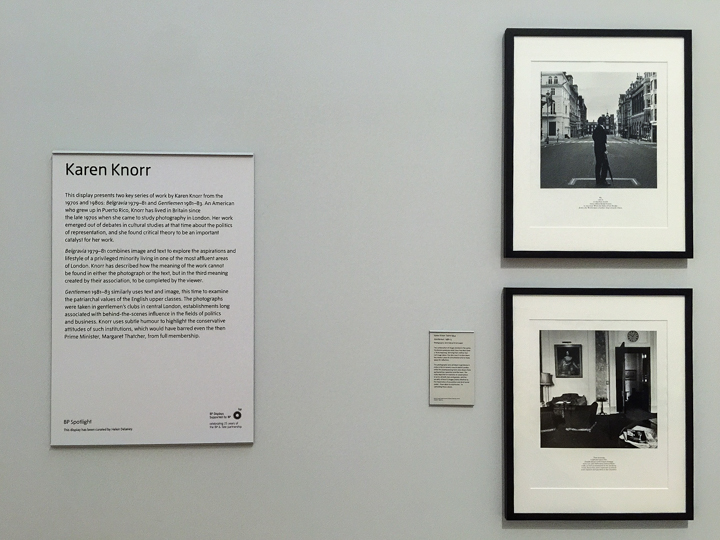
Belgravia is an examination and critique of the aspirations and lifestyle of the privileged few living in this very exclusive and affluent part of London. Gentlemen juxtaposes photographs taken in exclusive gentlemen’s clubs in central London with texts drawn from parliamentary speeches and the news. The work reveals the highly conservative nature of these institutions and their members.
My immediate reaction was that the image/text panels were far more imposing than they appear on line and in books. This is to be expected as the prints are much larger and have a significant physical presence. The image/text panels of her work were in black frames with a sizeable off white window mount. This gave them gravitas, as befitting the venue in which they were being shown. The work is installed in its own gallery with high ceilings and white walls—the veritable white cube. This says a lot about the status of Knorr’s work in the art world. It also occurred to me that the form of presentation and the venue itself resonated with the subject matter – the English Establishment. It was as if Knorr was critiquing the Establishment from within!
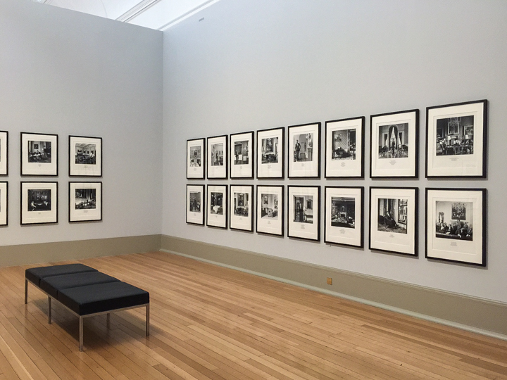
Installation view Karen Knorr Tate Britain Exhibition – December 2014
I found the arrangement of the framed prints a bit intimidating. The walls were densely packed —perhaps the idea was to intimidate and overwhelm? The downside is the image/text panels tend to merge into one another. In the panels describing the works Knorr is quoted as saying that the combination of image and text produces a third meaning completed by the viewer and that it also slows down the consumption of the work by the viewer. My own experience mirrored this and I found myself moving backwards and forwards between image and text taking time to consider what each panel meant for me. This is exactly the response I am hoping for with my own work.
I also found that the way in which Knorr organises the text was very important to how I perceived it. By including it on the panel, splitting the text into short phrases and using capital letters for key words mid sentence, Knorr directed how I read the words and made it clear that the text is not a simple caption.
The images were supported by a large panel describing Knorr’s career and giving a brief overview of the two series presented. Alongside each series was a smaller panel giving more information about each series and to clarify which series the viewer is looking at. The latter panels were in my opinion too small and to begin with I overlooked them and was not quite sure which series I was looking at.
Display panels — Karen Knorr Tate Britain Exhibition – December 2014
In the corner of the gallery there was a display cabinet. This seemed to fade into the background and it was only after a little while I realised it was there.
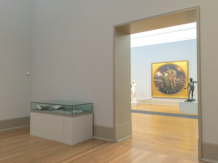
Display cabinet — Karen Knorr Tate Britain Exhibition – December 2014
The information on display were original copies of Knorr’s book Marks of Distinction along with exhibition catalogues, posters and magazine articles. All of this was useful background to contextualise the work, which is very much a product of the Thatcher years.
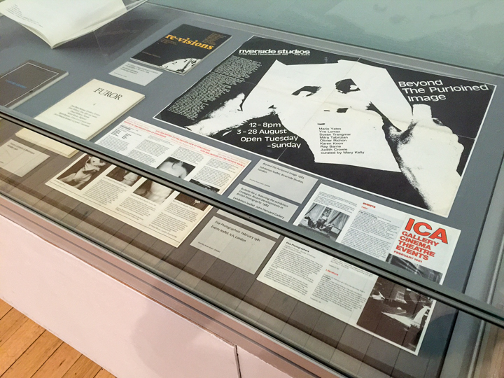
Display Cabinet with books etc — Karen Knorr Tate Britain Exhibition – December 2014
So what did I learn from my visit:
- First of all it strengthened my view that Knorr’s work is of great depth and quality. It takes time to appreciate the work which is a possible downside. The less engaged viewer might not be prepared to take the time.
- Larger prints do command attention and engage a different response, but they need space to breath in a gallery setting if each is to be considered in its own right. I need to consider this carefully in my own installation.
- The use of image and text in relay ‘worked’ to engage the viewer (me) in coming up with a ‘third meaning’ and in slowing down my ‘consumption’ of the work.
- Knorr’s approach to organising text to represent it as a separate and important piece of information works well. This confirmed for me that my idea framing the text to present it as a document (or page from a book) is on the right track.
- The text panels describing the works are very important and in this exhibition panels were too small, so much so that I missed them at first. I need to make sure that in my exhibition installation they are scaled and located appropriately to attract the attention of the viewer.
- The books, catalogues and so on in the glass case added significantly to the viewing experience. I hope my maps and Booth references will do the same.
This is an excellent exhibition and is well worth a visit. It could also be combined with a visit to the Turner exhibition currently on show at Tate Britain, making it doubly worthwhile!


jsumb
December 17, 2014
Your write-up is tempting me to ANOTHER exhibition! Though I might combine it with another Tate show, the one at the Modern. I was wondering about the Gentlemen series, do you think it has aged? Are we passed that moment? Just thoughts…
Keith Greenough
December 17, 2014
I am not sure if we are truly past the moment…..many of the aristocratic, public school and military clubs still do not allow women members and are populated by the upper echelons of society as defined by Eton/Oxbridge/Guards and so on. The current Tory government is largely populated by the members of these clubs. David Cameron recently declared that such clubs are a thing of the past, see http://www.telegraph.co.uk/news/politics/david-cameron/10187947/Gentlemens-clubs-are-a-thing-of-the-past-says-David-Cameron.html
This probably means that they are not a thing of the past…..