I am getting close to the end of shooting for the East London Project. Whilst I fully expect to keep making images right up until the end, from now on this will be directed at trying to improve existing images, rather than exploring completely new sites. Last night I visited what might prove to be my final ‘new’ site – Bethnal Green Road.
My approach to this shoot was similar to that of others I’ve made recently. I had reconnoitred the location and had in mind the nature of the image I wanted to make and the text that is to accompany the image. To make the image I had to book an overnight stay in Bethnal Green….not the most salubrious of East London areas. To make the images in darkness with no people, cars etc present I generally need to shoot after 10 pm or before 7 am in the morning. This either involves staying late in London, travelling in very early by car or as in this case an overnight stay.
When returning to the chosen location often what I find during darkness is not what I had expected following my daytime prospecting. The location of bright lights directed at the camera position is a significant problem. Also I have found that East London is often busier late at night than during the day!! Last night was a typical example. When I arrived to make my photograph in the evening, it was simply too busy to make the shot. I elected to return in the early morning. I used the time to validate that my original idea would work and to explore other options as a contingency.
I returned to the location at 5 am this morning, only to discover that a car was parked exactly where I needed to stand!! I revised my position but was not as pleased with the result. Because of this I went on to another location close by which I had found the previous night. Essentially the elements in the composition were similar but the direction of view was different. The previous evening there had been a pretty wild party going on at this second location (0utside a refurbished pub which was having an opening night). On my return the party seemed to still be going – 7 hours later – but the doors to the pub were now closed. As it turned out I much preferred this new photograph. The image/text panel I made is below:
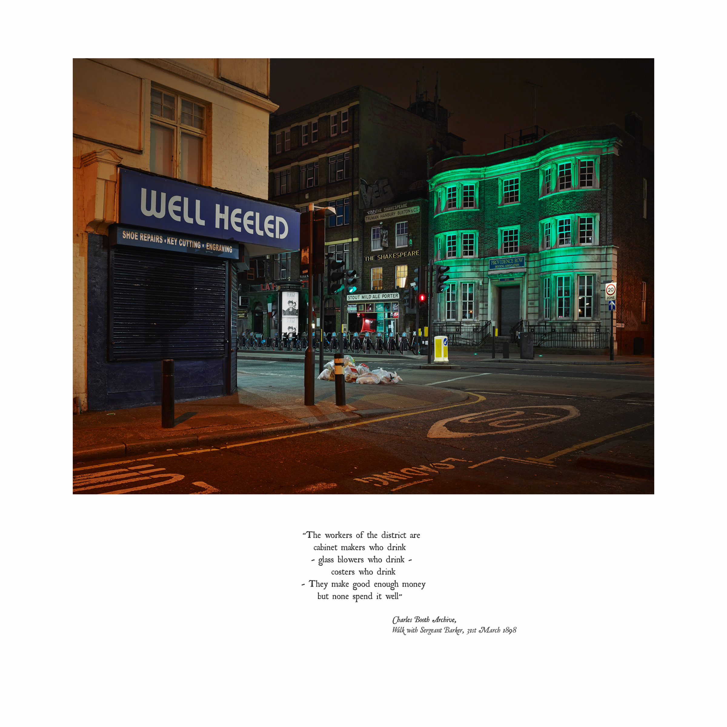
Bethnal Green Road
©Keith Greenough 2014
The text refers to the nature of the people living close to this location in Booth’s day – cabinet makers, glass blowers and costers. Booth observed that whilst they made good money they all drank it away. The image I made is stacked full of text. A shop called ‘Well Heeled’ echoes Booth’s reference to ‘making good money’. The ‘Providence’ Housing Association refers to the issue that none spend their money well. The pub in the centre has a big sign advertising ‘Stout, Mild, Ale, Porter’. This sign is old and might well date from Booth’s time (although it appears to have been repainted!). Even the road marking ‘Loading’ could be construed as a reference to getting ‘loaded’ or drunk. I think that this image works very well. Improvidence and drinking are social issues which remain with us today. The image/text pairing invites consideration of these issues in both the historic and modern day contexts.
I have presented this image/text panel in a form I have been experimenting with. The square format is what I have in mind for the photographs in landscape orientation. This leaves a significant amount of space for the text – allowing the text to assume equivalent importance to the image. By splitting up the text into short phrases and presenting it as if it were a poem, I further emphasise that the text has substance as a separate piece of information for the reader/viewer to consider (rather that it being simply a caption which explains what the image is about). It also allows me to place emphasis on the certain key words as the words at the end of lines generally carry more weight ( This is an approach used by Karen Knorr and was also mentioned by Anna Fox during the Study Visit we made to Farnham, see here). I have also given a clear attribution to the source of the text lending further weight to the text as substantial information in its own right (another point made by Anna Fox). Finally I have used an old font – in fact the font used in the first edition of Booth’s survey. This signals that the text is from the past. I plan a full explanation of my learning points from the work of Anna Fox and Karen Knorr in a separate post where I will review their work and its influence on my thinking.


Posted on October 2, 2014
0