I’ve just got back from a visit to the south of France. The trip combined a short family holiday with a trip to Arles to see some of the photography on offer at the Les Rencontres Arles Photography 2013 (LRAP13). This post is the first of two setting out my thoughts on what I found at the Rencontres….
Without a doubt the event in Arles was the largest and highest quality photographic festival I’ve attended. The theme is ‘Arles in Black’ placing emphasis on black and white photography (although there was plenty of colour work on show too). The exhibitions are grouped under four (loosely applied) headings: Them, Myself, There and Album. In addition there are exhibitions linked to the Rencontres d’Arles Awards and several other associated programmes. The scale of things is put in context when one realises that the associated programmes alone includes exhibitions of work by Bernd & Hilla Becher, Gordon Parks and Daido Moriyama.
In effect I had two days in Arles – it was not enough. My lack of time did cause me to get organised. This is definitely to be recommended. I also had to prioritise – I clearly was not going to have the time to see everything.
Cafe, Parc des Ateliers – Rencontres des Arles
I used half a day to plan and orientate myself. The venues are spread all over the town so it was very necessary to plan a route around. The Rencontres Arles iPhone app was a very useful guide/resource but walking about to figure out the lie of the land was a good idea. The exhibition sites are grouped into two main areas – the old town centred around the Hotel de Ville and the Parc d’Ateliers (15 minutes walk from the centre). In the old town many of the venues are beautiful churches and civic buildings, including the Espace Van Gogh which was originally a hospital (where Van Gogh was taken minus an ear). The ‘Ateliers’ are quite literally abandoned workshops on an old industrial site.
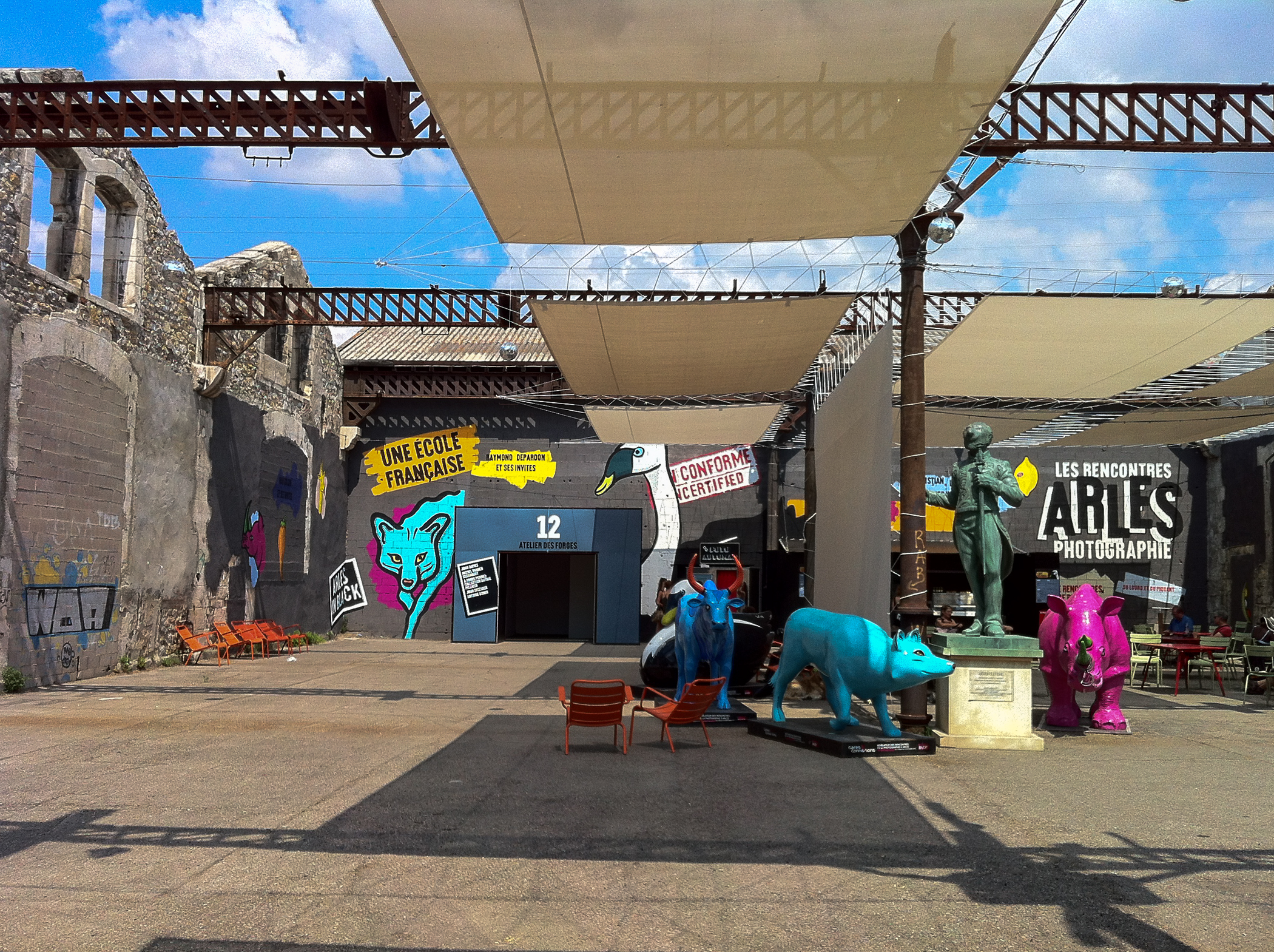
Parc des Ateliers, Rencontre des Arles
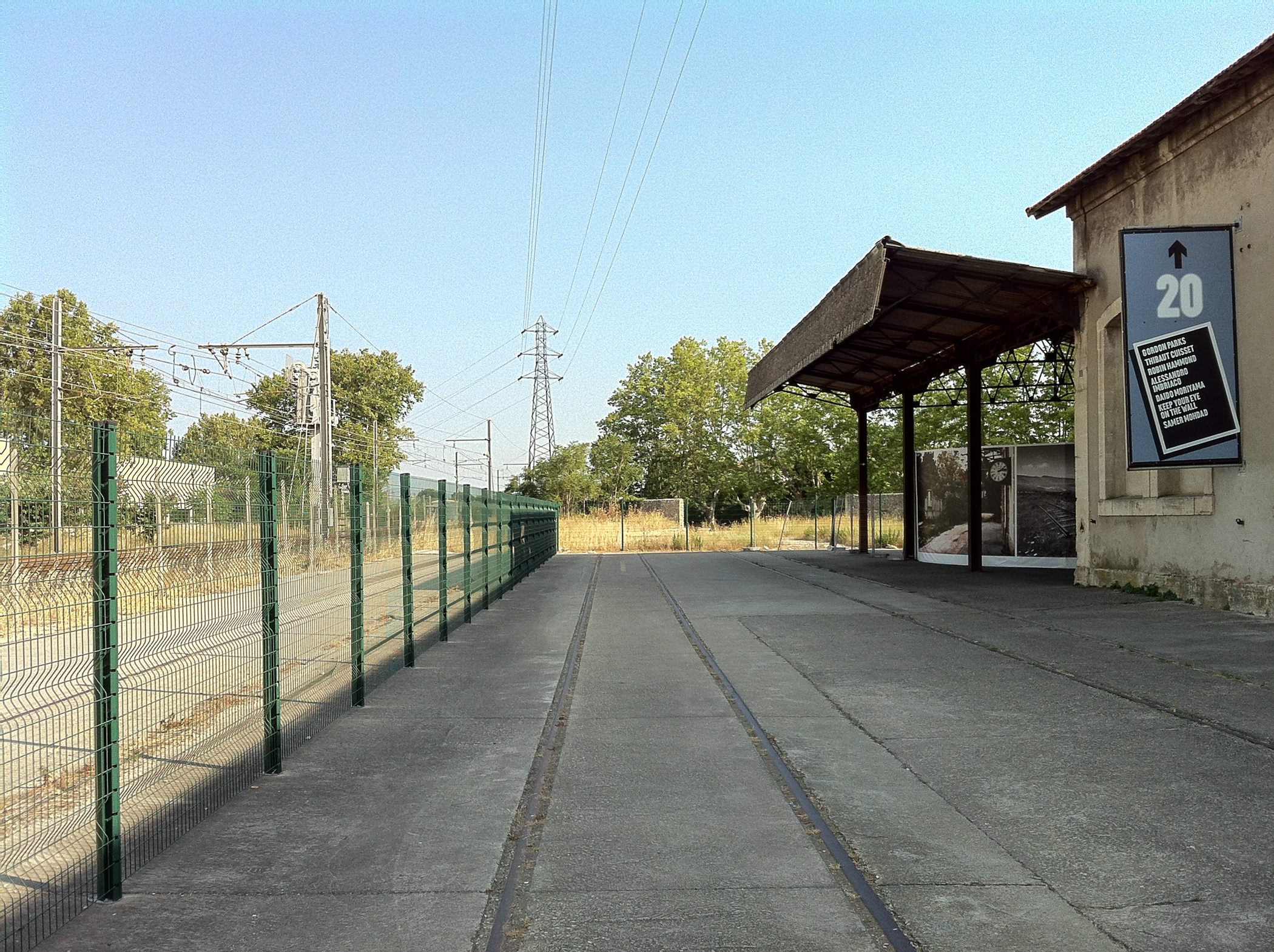
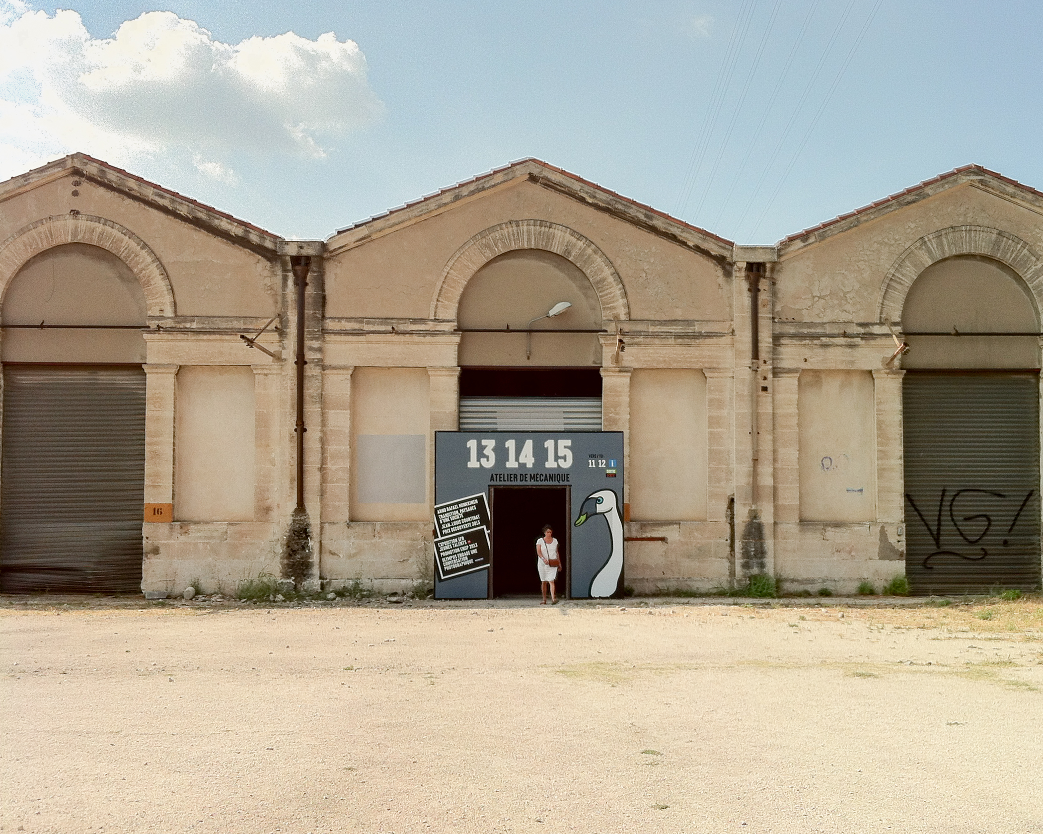
Parc des Ateliers, Rencontre des Arles
I had one full day visiting the venues/exhibitions I had earmarked. I visited 16 gallery spaces in 8 hours (some are very close to one another or adjoining). In 34C heat (most of the venues don’t have air-conditioning) this was pretty exhausting. Inevitably I spent more time in some venues than others. This is obvious from my notes (set out below) which focus on what most impressed me or was particularly relevant to my own work (which has been largely about portraiture in recent times).
The final half day was spent reflecting on what I had seen and visiting several bookshops where I was able to have a peek at books which I felt I might want to buy. I bought an English copy of the LRAP13 catalogue. It cost 46 Euro and gives an excellent overview of what is on offer. It proved a good idea to buy this on day one.
I have set out below, in the order I visited, my thoughts on the exhibitions that grabbed my attention the most. I am sure other work would have been on this list had I been able to spend more time. These notes should be viewed as just a snapshot of what is on offer.
Bernd & Hilla Becher (Arena Gallery)
This exhibition views the Bechers through the printed material they produced. It shows books, catalogues, posters and such like produced at different stages of the development of their now characteristic style. These demonstrate how their work evolved from documentary to conceptual. Their formal approach was refined over time. They seem to me to become more rigorous about how they composed the images. I also sensed that their thinking about how their photographs should be grouped and presented also changed. Early grids of photographs for example showed different types of industrial installation in the same grid. All of this is more evidence to support my own conclusions that I need to be flexible and adaptive, allowing my ideas to develop as I go along.
There were a few prints on show and I was surprised by how high key/low contrast they were. For me this does seem to emphasise the objectivity of their work – in sharp contrast to the dark, contrasty, expressive images of Sergio Larrain (see below).
The only downside of this exhibition for me was the fact that all the printed work was in German…..hardly surprising of course.
Alfredo Jaar – The Politics of Images (Eglise des Freres-Precheurs)
I had not heard of Jaar before – a major omission on my part. I found this exhibition thought provoking, highly relevant and very moving. In the words of the LRAP13 catalogue, Jaar’s work consists of ‘questioning photography when it plays the role of supposedly objective journalistic witness’.
The exhibition is made up of several installations.
‘Searching for Africa in Life’ comprises of four large panels each containing grids of front page covers of Life magazine. I didn’t count the exact number but at a guess I would say there were over 200. And not a mention of Africa in one of them. This speaks for itself.
‘The Silence of Nduwayezu’ is Jaar’s photographic record of the Rwandan genocide. It comprises of a single image, showing the eyes of a five year old boy, Nduwayezu. This child had witnessed the killing of both his parents and on arrival at the refugee camp had not spoken for four weeks. When I looked at the image of this child’s eyes I really felt that it truly represented the horror of Rwanda and that it did so in a way which maintained the dignity of the victims of this tragedy. As if to parody the enormous volume of photojournalistic images of the Rwandan crisis Jaar presents hundreds of copies of the slide of Nduwayezu’s eyes on an enormous light table. They are literally piled up. The installation is presented in its own space in this beautiful church. It left me speechless. The installation looks like this (note this is not the actual installation at LRAP13).
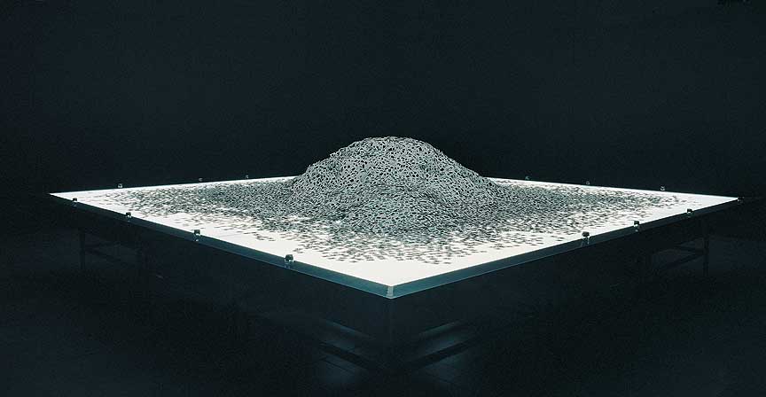
“The Silence of Nduwayezu,” 1997 – Installation view
© Alfredo Jaar
‘Three Women, 2010’ is an installation of three portraits of women. It is a simple, beautiful hommage to three extraordinary women who have been under-recognized for their human rights contributions to the world – Aung San Suu Kyi, Graça Machel and Ela Bhatt. The portraits are tiny – maybe 3×2 ins. Each is surrounded by six tungsten spotlights on stands. This is Jaar’s way of saying that these women have not been given the prominence in the visual media they deserve and that he wants to place them in the spotlight.
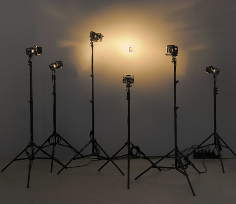
‘Three Women, 2010’
©Alfredo Jaar
These are just three of the installations on show – the ones which particularly caught my eye. The whole exhibition is fascinating. It showed me that conveying meaning through photography does not require books full of images. Indeed in some situations less is definitely more. Jaar’s installations are also an object lesson in creative presentation. He does not limit himself to conventional modes of representation.
Jacques Henri Lartigues – Bibi (Eglise des Trinitaires)
This exhibition falls under the heading of ‘Album’. It is a presentation of Jacques Lartigue’s family albums from the his years with his first wife Bibi (1918 – 1930). The Lartigue family were wealthy members if the bourgeoisie and apart from being a record of family life, the photographs also present an interesting historical record of the glamour and excess of the roaring twenties.
Lartigues’ photographs are action packed. Arms and legs are cropped. Horizons are slanting. The beach, tennis, fast cars, crashing aeroplanes populate the images alongside portraits of Bibi and other family members and friends.
The exhibition shows the original Lartigues’ leather bound albums. They are beautiful. With large photographs neatly organised with handwritten notes. The exhibition is tinged with sadness and regret. As the years pass by the estrangement between husband and wife becomes apparent within the photographs.
Hiroshi Sugimoto – Revolution (Espace Van Gogh)
Sugimoto’s photographs of night time minimalist seascapes and landscapes are presented in a cool dark room on the upper floor of the Espace Van Gogh. The photographs are large black and white prints lit by spotlights to highlight them within the darkness. The photographs reminded me of Mark Rothko’s black and grey colour field paintings which I saw at the Tate Modern (see here). The seascapes capture sea and sky and the course of the moon over a long period of time. They are also displayed turned by 90 degrees so that the horizons run vertically through the frame, further abstracting the images. The landscapes are more naturalistic and are presented without rotation.
Sugimoto reduces the seascapes to conceptual images. They are timeless and spatially ambiguous. In 2002, Sugimoto commented ‘I was concerned with revealing an ancient stage of human memory through the medium of photography’ or in other words his intention was to show the world as it might have been seen by people in ancient times.
The photographs invite contemplation and the space feels like a church or other religious place (if this makes sense). I enjoyed the exhibition but I don’t think it works so well in book form or online. The photographs need to be seen together at full size in a space which allows quiet introspection.
This photograph illustrates how the Revolution installation looks:
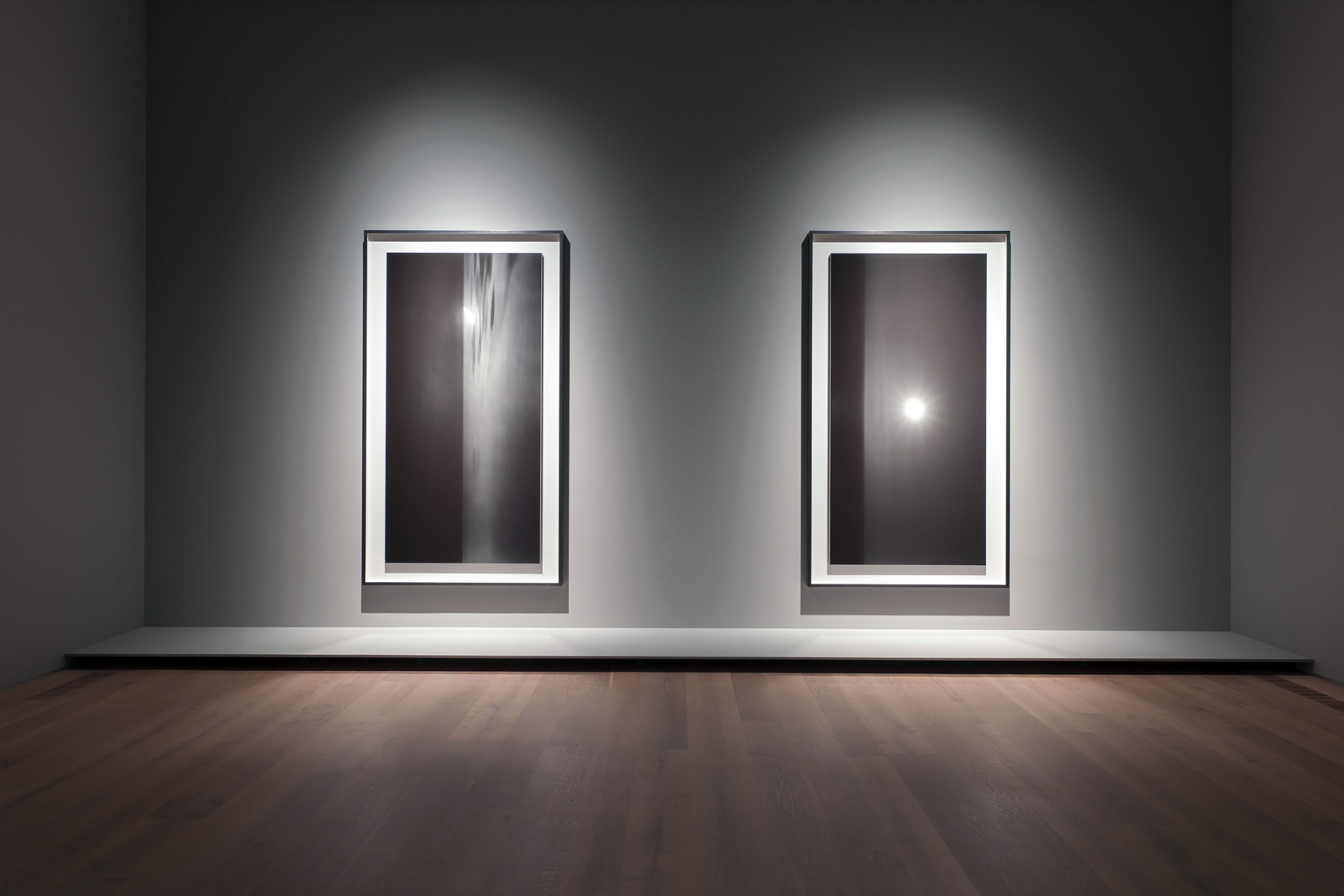
Revolution – Installation View
© Hiroshi Sugimoto
I found the juxtaposition of the naturalistic landscapes with the abstract seascapes interesting. The landscapes had the effect of grounding (excuse the pun) the exhibition in reality. They also completed the trinity of land, sea and sky – the components of the world when first populated by man.
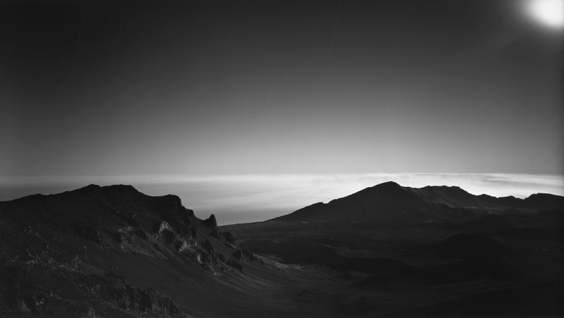
Hiroshi Sugimoto, Landscape 004, 1989, Gelatin silver print, 47 x 83″, © 2012 Hiroshi Sugimoto.
What I like a about Sugimoto is the combination of conceptual interest and photographic invention and ‘craft’. These are elements which I value in my own photographic practice.
Sergio Larrain – Retrospective (Eglise Saint-Anne)
Larrain was a long standing member of Magnum Agency and his work is very typical of the personal documentary style practiced by many Magnum photographers. He worked exclusively in black and white with a Leica rangefinder. His images are of scenes and people from all over the world.
His style appears strongly influenced by surrealism. He makes frequent use of high/low viewpoints, curious juxtapositions, shadowy figures, blurred foregrounds,soft focus and so on to ‘give form to this world of fantasies’. The resulting images are visually arresting, but somewhat opaque or more positively open to interpretation. They are not documents but personal expressions. This image of London’s Portobello Road in 1959 is a good example of his style (see here). It is taken from a very low viewpoint. the legs of two women occupy the foreground. In the background there is a small figure. Gulliver’s Lilliput comes to mind. It is a clever image with strong psychological presence, but it says very little about the Portobello Road in 1959.
The biographical information portrays Lorrain as a remote guru-like figure – a reclusive genius with a unique voice….it is clear that Larrain was a Modernist photographer!
The Larrain Retrospective is the largest exhibition I visited and is fully consistent with the black and white theme of LRAP13. It is clear that the curators of the festival are open to all styles of photography. Modernist personal documentary sits alongside critically based conceptual work.
It is interesting when I look at Larrain’s photographs I find them intriguing, aesthetically appealing and technically very accomplished. On the other hand when I look at them critically I see them as exercises in form over content- virtuoso performances by the auteur photographer. There must be a balance between these two positions. Excellent photography with a conceptual voice. In my view, Larrain does not achieve this balance. Sugimoto does.
In part two, I will move on to summarise my thoughts on exhibitions by Marion Gronier, John Davies, Wolfgang Tilmans and Gordon Parks. I will also talk about my impressions of the nominees for the 2013 Discovery Award and the annual Book awards.


Keith Greenough
July 22, 2013
Some people have said that this post is not accepting comments….thought I would test this out.
jsumb
July 27, 2013
Trying again, just finished a week here in Arles, it was inspiring and have re-read your notes. I missed the Becher’s as I think I said I would, but will look forward to hearing part two. My report should be ready in a couple of days. Hope the weekend ‘wet-plate’ went well.
vickiuvc
July 28, 2013
I didn’t like my comments Keith? Posted them just after you put the post up—but just to say thanks for the brief—it gives some idea of what to see; and also made me start thinking about planning my visit. No agenda yet from the OCA; so I might make my visit more self-directed. Where did you get your catalogue? I thought about getting one before I went and contacted the Arles office; but heard nothing back?
vickiuvc
July 28, 2013
Meant to say “it didn’t like my comments…!”
Keith Greenough
July 28, 2013
Thanks Vicki…strange post was not accepting comments….I bought mine in a bookshop in Arles. They had loads of copies and versions in different languages. I can only find the French version on Amazon….
Catherine
August 4, 2013
Good to read your thoughts Keith. I’ve started to make a list. Lartigues particularly interests me.