I discovered Bettina von Zwehl’s work late in my exploration of ‘Disarming the Pose’, whilst investigating the question of how long exposure times inhibit self conscious posing by the photographic portrait subject.. It is a pity I didn’t ‘discover’ her earlier as much of her photography is highly relevant to my own work.
Bettina von Zwehl Photoworks/Steidl monograph
Von Zwehl has experimented with various means of distraction of the portrait subject. She has photographed subjects who have just been exercising vigorously (my own ‘I am an Ironman’ series echoes this); who have just been woken up from sleep; who have been placed in a darkened room listening to music; and who are simply asked to breath in and to breath out. In her own words she ‘developed strategies and rituals to distract the sitters from posing, none of which are revealed to the viewer immediately.’ (von Zwehl 2007, pp71)
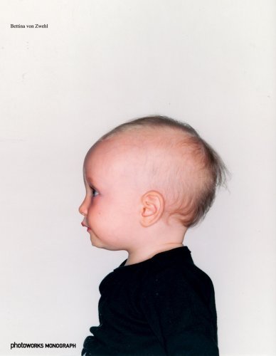
She takes considerable steps to avoid viewers of her portraits from being diverted from her subjects’ facial expressions. She uses plain backgrounds and she asks her subjects to dress in plain clothing (in fact for each series the clothing of all the subjects are the same) and she asks them to remove jewellery, watches and such like. Her approach is clinical and highly scientific. Indeed it seems to reference early uses of photography in criminal and medical research.
I was particularly influenced in my own 45 seconds…. work by Atemwege (Bettina von Zwehl Website), a series in which she presents diptych’s of her subjects with one portrait of them breathing in and the second of them breathing out. The differences between the two portraits in each case are small but discernable. They are more evident in some diptych’s than others. Indeed, discovering the difference in one pair made me look again more closely at the others. This is just the response that I am hoping to achieve with my own series of diptychs.
von Zwehl’s stated aim is to explore what “appears and disappears in people’s faces if they let go of their photographic ‘mask'” (von Zwehl 2007, pp. 71). This is also what fascinates me. I have had much debate with fellow students on this blog about my aim of achieving authenticity in my portaits. I am beginning to think that a better way to express my intentions is that I want to explore what remains when the photographic ‘mask’ is removed. In a way I see von Zwehl’s work (and indeed my own) as an antithesis to conventional portraiture with its concentration on posing, acting and reacting to the camera.
She works in series believing that it is only in this way that small differences in responses to the stimuli through facial expression become apparent. This has also become my preferred way of working. For me a series of portraits definitely adds more information and interest than the sum of the individual portraits. Cross comparison and repetition allow the viewer to gain more from the portraits. Differences are noticed and become significant; elements which are repeated take on greater importance and so on. I think that one of the reasons why I have yet to write up my several visits to the Taylor Wessing Portrait Award exhibition is that I have become less inspired by individual portraits. I will post my thoughts on this exhibition which has now finished soon.
I confess that much of what von Zwehl says strikes a chord with me. She maintains that she is not interested in showing the essence, character or aspects of self with her work. Rather she is curious about ‘examining each sitter as a responsive , physical being – only pointing to their inaccessible inner world’ (von Zwehl 2007, pp 72). The notion that a photographic portrait simply reveals the surface of the subject and only points to the inner self is also echoed by Richard Avedon who maintained that ‘My photographs don’t go below the surface. They don’t go below anything. They’re readings of the surface. I have a great faith in surfaces. A good one is full of clues’ (Richard Avedon Foundation Website).
For me, Avedon’s clues simply point to what might have been going on in the mind of the sitter at the time of the photograph (consciously and unconsciously). This may or may not provide insight into the true character of the individual. I have thought a lot about the question of whether a portrait can (or cannot) communicate character. Take for example Karsch’s famous portrait of Winston Churchill, which can be seen here. Many if not most people would say that this portrait sums up Churchill’s character – the dogged British Bulldog Statesman. But of course hardly anyone will have been in a position to judge the man as he really was. This portrait fits with the public image and propaganda surrounding Churchill the statesman. In fact on this occasion, as Karsh’s biography reveals, Churchill was angry at being tricked into having his portrait made. A quick search on Google images will reveal many other portraits of the great man, each of which may offer an ‘alternative’ reading of his character. Which is the real Winston Churchill? Only those who were close to him will really know.
But I divert…returning to Bettina von Zwehl…. Much of her work references Renaissance art. For example, she made profile diptych’s which were modelled on Piero della Francesca’s wedding portrait of Frederico da Montefeltro and his wife, which is also a profile diptych with the wedding couple facing one another, see here. She has also tended to devote particular series to particular groups of people according to their age. This makes cross comparison more valid as the obvious explanations of differences because of age are eliminated from consideration.
I have said much about what I find interesting about von Zwehl’s work. There is one aspect however which concerns me. At first sight her photographs appear a little dull. They don’t immediately grab the viewer’s attention. I wonder if this is an inevitable consequence of the process she follows. My dilemma is that whilst I agree with many of her guiding principles, I also believe that if photography is to command attention and gain an audience it has to be visually compelling. There is food for thought here….. It is entirely possible of course that were I to see her work in a gallery with large scale prints my response could be completely different. I have only seen small prints on the internet and in her monograph so far. I look forward to visiting an exhibition of her work although I am not aware of any in the UK at the moment.
von Zwehl’s work can be seen on her website.
References
Bettina von Zwehl Website Available from: http://www.bettinavonzwehl.com/main.html [Accessed on 24th February 2013]
Richard Avedon Foundation Website Available from: http://www.richardavedon.com/#mi=1&pt=0&pi=7&p=-1&a=-1&at=-1 [Accessed on: 24th February 2013]
von Zwehl B. (2007) Bettina von Zwehl Gottingen: Photoworks/Steidl


Catherine
February 25, 2013
I had several thoughts here. A real contrast is the work you did in compositing images of yourself – most of your bodily surface is opaque but your face is clearer with your eyes commanding attention. Regarding von Zwehl’s work appearing a little dull – could this be because it is more static due to longer exposure? Also if a subject isn’t smiling maybe the viewer is not being invited in in the same way. Having said that, I think her portrait miniatures are exquisite.
Keith Greenough
February 25, 2013
From what I’ve read the direct address is generally interpreted as a ‘demand’ for the viewer to enter into a parasocial relationship with the portrait subject. I guess if the subject is not smiling this will alter the nature of such a relationship and it could be that some viewers might even look away.
In my own experience I would say this is the case. I definitely relate differently to a portrait subject who is looking directly at me.
In the case of von Zwehl’s work many of her subjects are in profile or are averting their gaze. This allows the viewer to scrutinise them in the same way as one would look at an object – there is no fear of being caught staring!
The static nature of her work is more likely to be due to the processes she asks her subjects to follow. I guess I was thinking that the way she gets her subjects to wear neutral coloured clothing and the fact that she uses plain lighting and backgrounds does make them look (in small print) very dull.
I think they would be much more commanding in large prints. Or in very small prints like the miniatures, which I agree are lovely. The lighting in the miniatures is much more dramatic, as is the tonal contrast. The complimentary colour combination of earth tones and blues also work very well together and the hairdos of her subject also provide a great deal of interest.